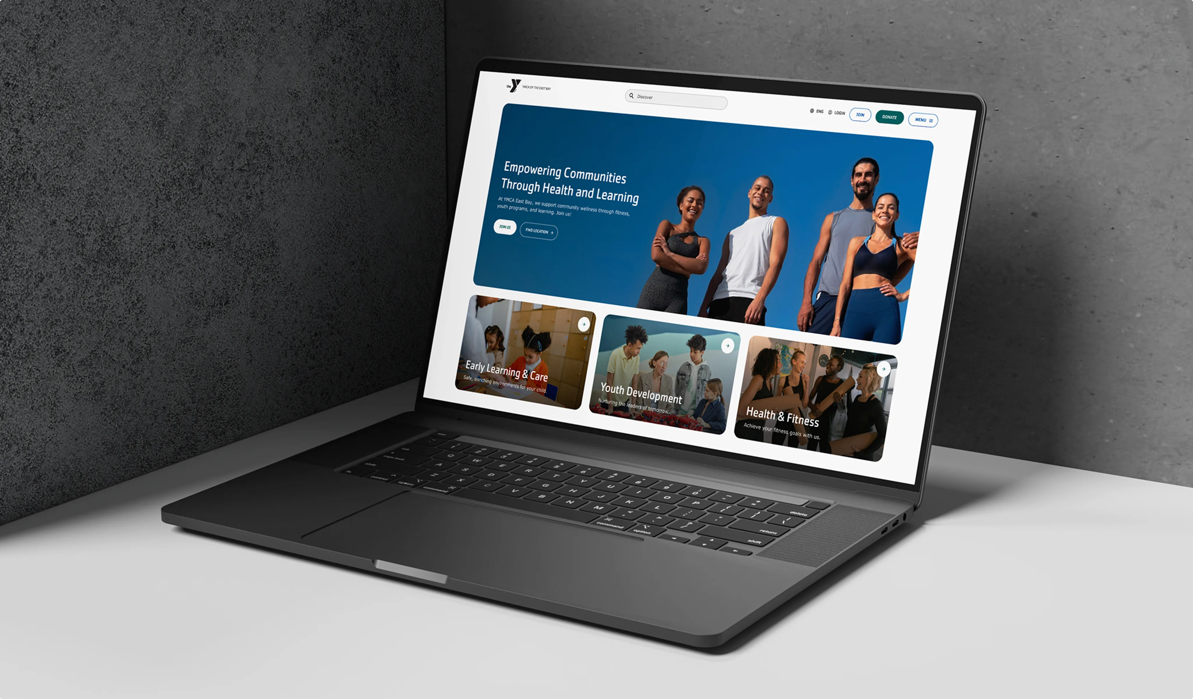
YMCA of the East Bay recognized that its previous site primarily served fitness users, while families in early learning, youth programs, seniors, and camp participants often struggled to find what they needed. Together, we set out to build a platform that gave every audience equal attention. The result was a redesigned main site supported by three microsites, each tailored to its community. We also introduced new digital tools that made joining, registering, and exploring programs far simpler, while giving staff a system that’s easier to manage and expand.
Client profile
YMCA of the East Bay is a true community hub, serving people of all ages and backgrounds across Alameda, Contra Costa, and Yolo counties. More than a place to exercise, it is where families find care, young people discover opportunities, and neighbors come together to strengthen their communities. With programs in Health & Fitness, Early Learning, and Youth Development, the YMCA’s reach extends across multiple counties and thousands of lives.
68
KPeople served across three counties
25
KCommunity members supported at 5 fitness centers
4
KKids and teens participating in enrichment programs
Challenges & goals
As the YMCA of the East Bay grew its reach, the website became increasingly difficult to rely on. Parents looking for childcare, members checking schedules, or donors wanting to contribute all ran into friction at key moments. Information was hard to locate, registration sent users into external systems with extra logins, and donation flows were fragmented.
On the backend, content management was just as problematic. Staff had to navigate dozens of overlapping content types, a complex paragraph structure, and no preview tools, which made even small updates time-consuming and risky. Brand consistency across branches suffered as a result.
From these challenges, the redesign set out to achieve five clear goals:
- Improve user journeys. Make joining, registering, and exploring programs straightforward and more intuitive for all audience groups.
- Build audience-specific microsites. Create distinct spaces for Fitness, Early Learning, and Youth Programs while keeping them connected under a single platform.
- Strengthen content management. Consolidate content types, simplify editing tools, and introduce previews so staff can update content quickly and consistently.
- Integrate core systems. Seamlessly connect Daxko and GroupEx Pro so schedules and memberships can live directly within the site.
- Enable Measurement & Growth. Implement analytics and SEO best practices to track engagement, measure conversions, and support long-term digital expansion.
Discovery phase
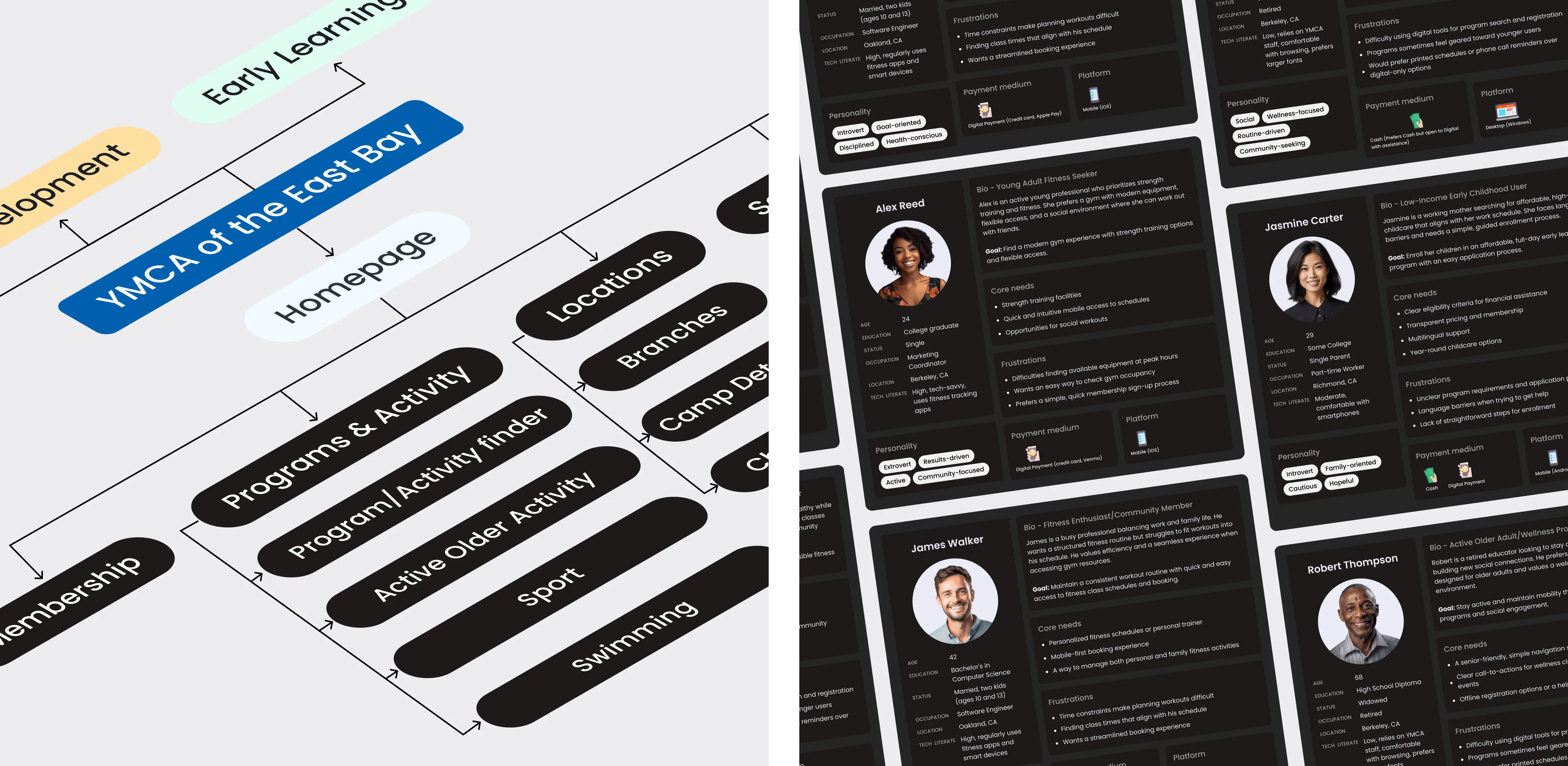
From the start, we approached discovery as a collaborative process with the YMCA team. We didn’t just review the site; we documented user journeys, created personas, and tested early assumptions together. This gave everyone a shared view of how different audiences interact with the Y online.
Our analysis showed that fitness members, early learning families, and youth program participants followed very different paths, with little overlap. We translated these findings into a clear architectural plan: a main site supported by three distinct microsites, each tailored to its audience but connected by a consistent design system.
We also uncovered smaller but critical insights that shaped the roadmap. For example, clarifying navigation so program details weren’t hidden deep in the site. By the end of discovery, we had a blueprint that balanced the YMCA’s wide mission with a clear, usable structure for staff and community alike.
Each area of focus has its own priority and its own community. For a long time, our website tried to be everything for everyone, and that left people frustrated. What we want is clarity – a site where parents, members, and supporters can each find exactly what they need.
Manny Nungaray
CDO, YMCA of the East Bay
New information architecture & design
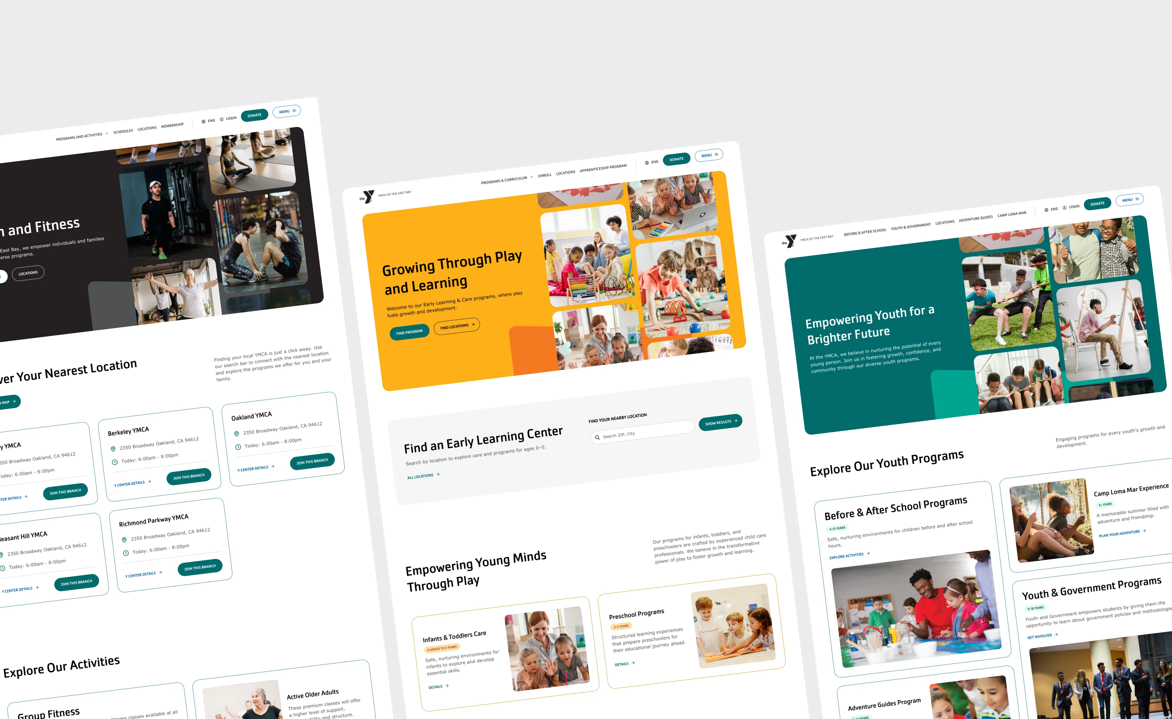
The old one-size-fits-all structure forced everyone through the same paths. We reorganized the site around three distinct microsites – Fitness, Early Learning, and Youth Programs – while keeping them connected under the main site. Each section was designed to reflect its audience: fitness pages feel modern and competitive, early learning pages emphasize warmth and trust, and youth program pages highlight energy and opportunity. To keep things clear and accessible, we applied consistent card layouts, strong visual contrast, and a mobile-first design, knowing most visits come from phones.

Clearer navigation
Visitors can now reach key information quickly without sorting through unrelated content.
Distinct experiences
Each microsite reflects its audience with a tone that feels modern, warm, or energetic.
Mobile-first design
Layouts adapt seamlessly to small screens, matching how most people access the site.
Integrated digital tools
A major focus of the redesign was reducing friction in how people interact with the YMCA online. Before, families had to manage broken links, multiple logins, and scattered information, while staff spent hours fixing errors and keeping content up to date. To solve this, we developed three core applications directly connected to Daxko and GroupEx Pro.
Program Finder
Previously, program registration relied on static links that often broke or sent people to the wrong place. Staff maintained these links manually, which was time-consuming and prone to error. The new Program Finder connects directly to Daxko’s API, allowing visitors to filter by age, location, or activity and register in one flow without leaving the site. For staff, it removed the burden of updating hundreds of links; for families, it created a single, reliable entry point.
Membership builder
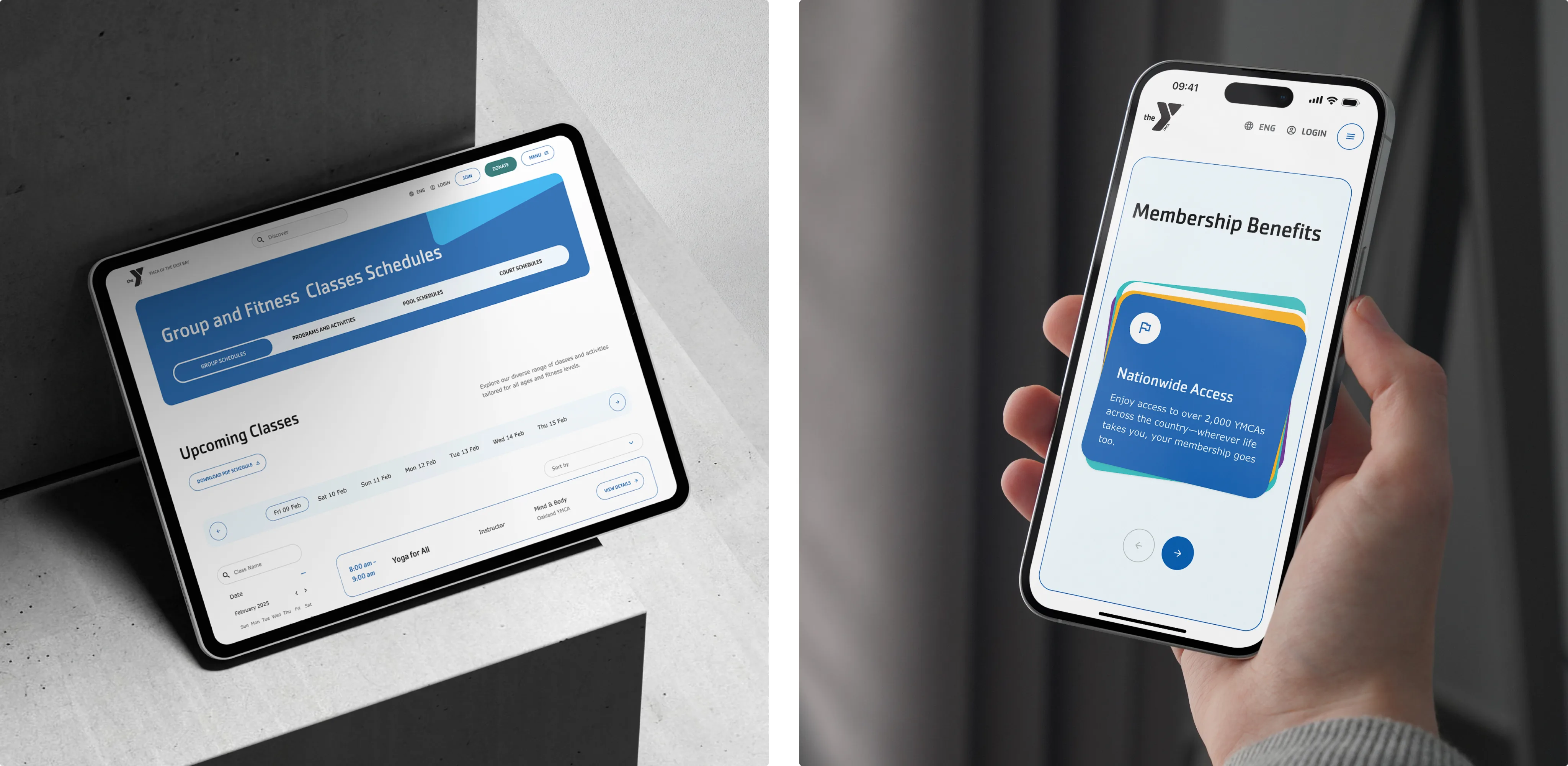
On the old website, membership information was difficult to navigate: prices weren’t visible on the site, options varied by branch, and the path to purchase often left people unsure which plan was right for them. To address this, we created a Membership Builder that asks simple questions and then presents the relevant membership options by branch. Once a choice is made, users are passed into Daxko to complete checkout. The tool clarified what was available, gave prospective members more confidence in their decision, and reduced the amount of time staff spent explaining membership details.
Schedules
Group exercise schedules were already available on the website, but the embedded view from GroupEx Pro made them hard to read and navigate. To improve this, we integrated the GroupEx Pro API into a custom schedule tool that lives directly on the site. Visitors can now filter by date, location, or class type, and even export a PDF for offline use. The result is a more user-friendly experience for members and fewer schedule-related inquiries for staff.
Together, these tools turned routine frustrations into reliable digital experiences. Families can now register for programs, compare memberships, and check schedules in minutes, while staff spend less time on maintenance and more time supporting their community.

Flexible content & microsite management
Alongside the new design and tools, we built a content system that gave staff more control without sacrificing consistency. Each program area now operates as its own microsite with dedicated navigation and landing pages. Permissions are role-based, so branch staff can update local content while maintaining a unified brand. Editors can duplicate blocks, save drafts, reuse sections in the Layout Builder, even in different content types, and adjust layouts without technical workarounds.

Results
The redesign gave YMCA of the East Bay a digital platform that finally matches the scale of its community work. What was once a single, overextended site is now a main hub supported by three audience-specific microsites, each built around the needs of its users. Integrated tools like the Program Finder, Membership Builder, and dynamic schedules connect directly to Daxko and GroupEx Pro, removing barriers that frustrated families and staff for years.
At the same time, a flexible content system allows staff across branches to publish updates quickly and consistently. Together, these improvements created a platform that supports growth, reduces daily friction, and reflects the YMCA’s role as a true community hub.
Simpler Journeys
Families and members now register, explore programs, and check schedules directly on the site, making everyday interactions noticeably easier.
Stronger Operations
Content updates that once took hours and technical workarounds can now be done in minutes, giving staff more time to focus on serving their community.
Future-Ready Platform
Integrated tools, analytics, and microsite flexibility give the YMCA a digital foundation that can scale with growth and improve collaboration across branches.
Project tech stack
Drupal 11
PHP 8.3.x
Symfony Components
Daxko
Vue.js 3
Twig
Tailwind CSS v4
Leaflet
Google reCAPTCHA
Google Analytics 4
Future collaboration
With the new platform in place, our collaboration continues. The next steps will focus on expanding microsite functionality, adding Microsoft Clarity for deeper analytics, and continuing performance and accessibility improvements. Ongoing support will ensure the YMCA’s digital presence keeps growing alongside its community, and our team is proud to be a long-term partner in making that growth possible.


