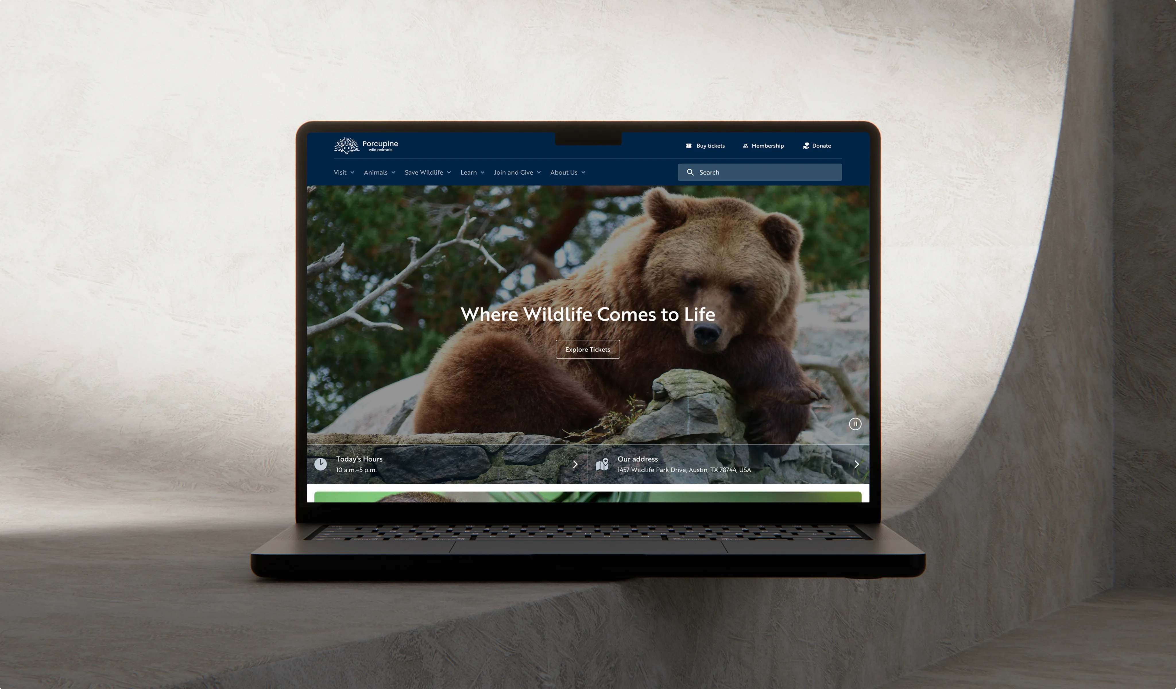
Working closely with the client team, we used the website redesign as an opportunity to reorganize how the organization presents itself online. Built on WordPress, the new platform brings together visitor services, educational programs, memberships, and conservation initiatives through clearer navigation, stronger visual storytelling, and a flexible content management system that supports the organization's day-to-day operations and future growth.
Client Profile
For many people, the zoo is a place to connect with wildlife and spend time with family. Behind that experience is a nonprofit organization dedicated to wildlife conservation, education, animal care, and community engagement. Every visit, membership, donation, and educational program contributes to a broader mission of protecting wildlife and inspiring future generations.
The website plays an important role in bringing those experiences together. It helps visitors plan their day, families discover programs, members stay connected, and donors support conservation initiatives. As the organization expanded, the website needed to do more than provide information; it needed to communicate the full scope of the zoo's work while making it easier for every audience to find what they were looking for.
1920
sFounded as a conservation-focused organization
850
+Animals living in naturalistic habitat settings
1
M+Guests visiting the zoo and programs annually
Challenges
As the zoo's programs and digital presence continued to grow, the gap between the organization and its website became increasingly difficult to ignore. Information had accumulated over many years, making the site harder to navigate, harder to maintain, and less effective at helping people find what they needed. Even simple questions often resulted in calls to the front desk because visitors couldn't easily locate the answers themselves.
The challenge wasn't limited to user experience. The hard-coded platform made routine updates slow and dependent on developers, while long blocks of text, limited mobile usability, and search that couldn't surface FAQ content made the website feel increasingly disconnected from the welcoming experience people encountered at the zoo itself.
Limited content control
The hard-coded website prevented teams from managing content independently, slowing updates and creating reliance on technical support.
Fragmented user journeys
Key actions such as planning visits, exploring programs, and upgrading memberships lacked clear guidance, making them difficult to complete.
Weak digital experience
Cluttered layouts, text-heavy content pages, and poor mobile usability made the website harder to navigate and less engaging for all user groups.
We are a conservation organization first and foremost, and we wanted the website experience to reflect that in a clearer and more engaging way.
Chief Communications and Engagement Officer
Discovery Phase
To understand the root of the issues, we worked closely with teams across guest services, education, conservation, and marketing to map how content was created and used in practice. These sessions revealed that the website had grown around internal needs rather than user intent. As a result, critical information, such as group reservations and program details, was spread across multiple pages, while key actions, like booking or upgrading memberships, were not clearly guided.
At the same time, user behavior and staff feedback highlighted a consistent gap: visitors came with clear goals but struggled to complete them, often turning to the front desk for help. The site relied heavily on dense, text-heavy content, underused existing visual assets, and made it harder to scan, especially on mobile, where most users accessed the site. This reinforced the need to rethink not just design but also structure, content ownership, and the platform's support for day-to-day operations.
As a result, the project aligned around several key goals:
- Structure the website around clear user journeys instead of internal departments
- Consolidate and standardize content to reduce duplication and confusion
- Simplify access to key actions such as booking, memberships, and programs
- Enable self-service content management for internal teams
- Improve content presentation through stronger visual and mobile-first design
- Better communicate the zoo’s conservation mission through the digital experience
Solution
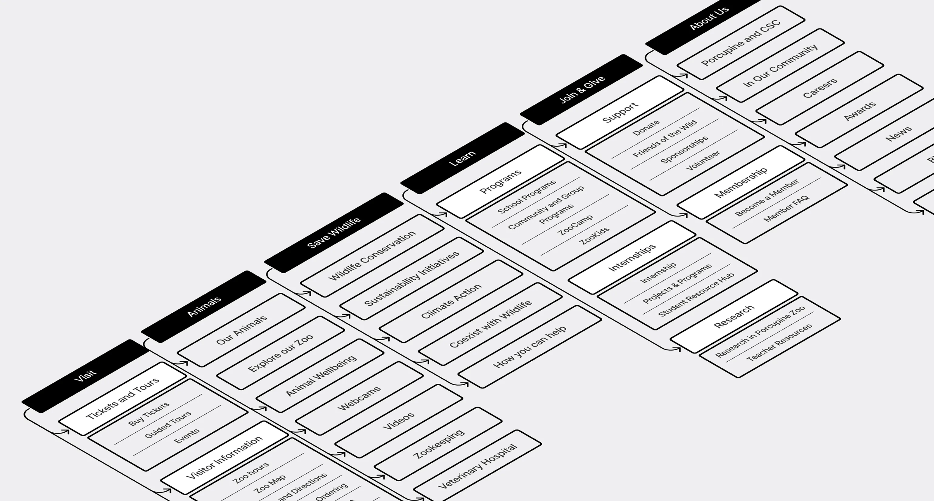
Information architecture aligned with real user journeys
The first step was restructuring the website around how visitors actually interact with the zoo. Instead of mirroring internal departments, content was reorganized into clear, user-facing sections such as Visit, Animals, and Save Wildlife.
This made key paths, like planning a visit, exploring programs, or supporting conservation, easier to follow. Previously fragmented content, including group reservations and program information, was consolidated into single, consistent locations to reduce duplication and confusion.
Visual design that supports clarity and engagement
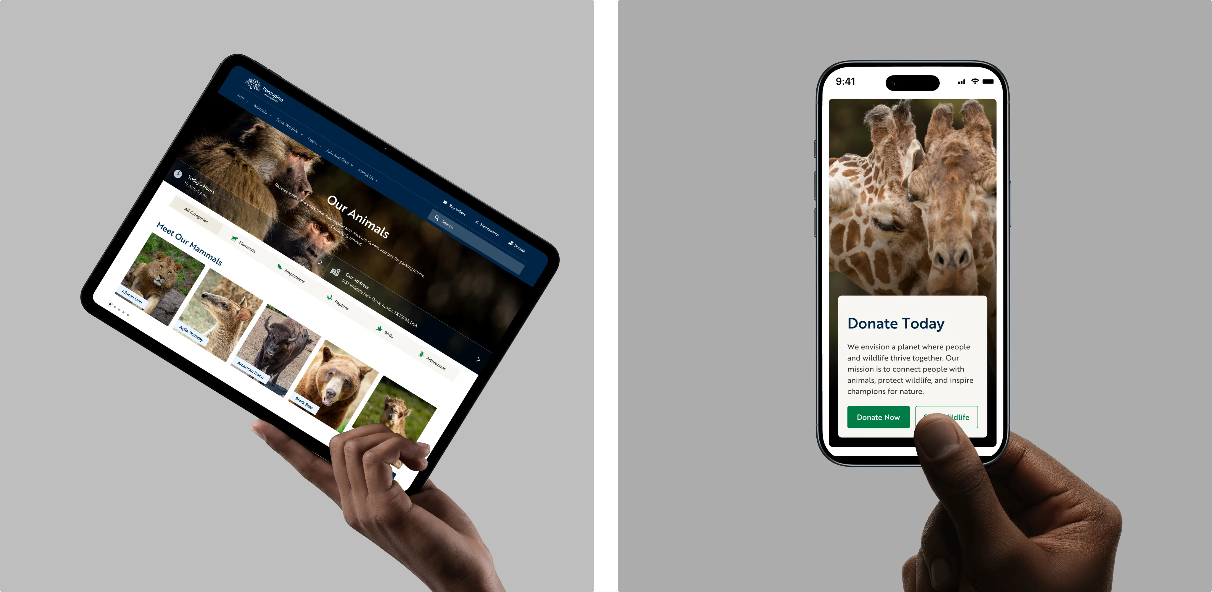
The redesign shifted away from dense, text-heavy pages toward a more visual and scannable experience. Large, high-quality animal photography, provided by the zoo’s internal team, became a central element, helping communicate the mission more effectively.
Content was restructured into shorter sections with a clear hierarchy, while detailed information (such as schedules or additional resources) was moved into overlays and expandable elements. This kept pages clean while still providing access to depth when needed, especially important for mobile users.
Flexible WordPress platform for content management
To address operational challenges, the website was rebuilt on WordPress with a modular content system. Around 90 custom blocks were developed, allowing teams to create and update pages without relying on developers.
This replaced rigid, hard-coded templates with flexible components that support different content types across departments. As a result, teams can now manage updates independently while maintaining consistency across the site.
The architecture also allows for future improvements, including more integrated booking experiences and AI-assisted tools to help users find information and reduce reliance on support teams.
The transition itself was carefully managed to ensure continuity. Existing content, including blog and news sections, was migrated automatically to preserve structure and reduce manual effort. Redirects were implemented across the site to maintain existing URLs, prevent broken links, and protect search visibility. This allowed the new platform to go live smoothly without disrupting ongoing operations or user access.
Project tech stack

WordPress

PHP

TypeScript

Tailwind CSS
Advanced Custom Fields PRO

Rank Math SEO

Simple History
Folders
100
%Website availability maintained during migration and launch
4
xFewer front-desk inquiries related to website information
24
/7Access to information about visits, programs, and memberships
The redesign helped simplify many of the experiences that previously confused both users and staff. Information is now easier to find, key actions are more clearly guided, and internal teams have much more flexibility to manage and update content without relying on developers for everyday changes.
Chief Communications and Engagement Officer
Results
Today, the organization has a website that better represents the organization behind it. Information that was once scattered across the site is now organized into a more cohesive experience, making it easier for people to discover programs, understand the zoo's conservation work, and complete the actions that matter most.
The redesign also changed how the website is managed behind the scenes. With WordPress replacing the previous hard-coded platform, internal teams can publish updates independently, respond more quickly as information changes, and continue improving the website as the organization evolves.
Connected experiences
Visitor services, educational programs, memberships, and conservation initiatives are presented through clearer navigation and a more engaging visual experience.
Team-owned content
WordPress enables internal teams to update, organize, and publish content independently, keeping information accurate without relying on developers.
Room to evolve
A flexible platform makes it easier to expand the website with new programs, campaigns, and visitor experiences as organizational needs change.
Future Collaboration
Our collaboration with the client continues as the organization expands its conservation work, educational programs, and community initiatives. Current efforts focus on refining booking and membership experiences, using analytics to better understand how people interact with the website, and continuously improving key user journeys based on real visitor behavior.
This ongoing collaboration ensures the website continues to grow alongside the organization, helping more people discover its programs, understand its conservation work, and find meaningful ways to become part of it.