Ever clicked a button and wondered if it worked? Or waited for a page to load with no clue if anything was happening? That’s what a website without microinteractions feels like – flat, frustrating, and forgettable.
Website microinteractions are those tiny design touches – like a button changing color on hover, or a subtle animation when submitting a form – that guide users, provide feedback, and create a smoother, more human experience. Done well, they can transform a good website into a great one.
Let’s explore 10 ways microinteractions can improve your website’s UX and how you can apply them effectively.
What Are Website Microinteractions?
Before diving into specific examples, let’s clarify: Microinteractions are small, contained moments where the user and the interface interact. Their purpose? To provide feedback, enhance usability, and improve engagement. Think of them as the glue that holds together the larger parts of your user experience.
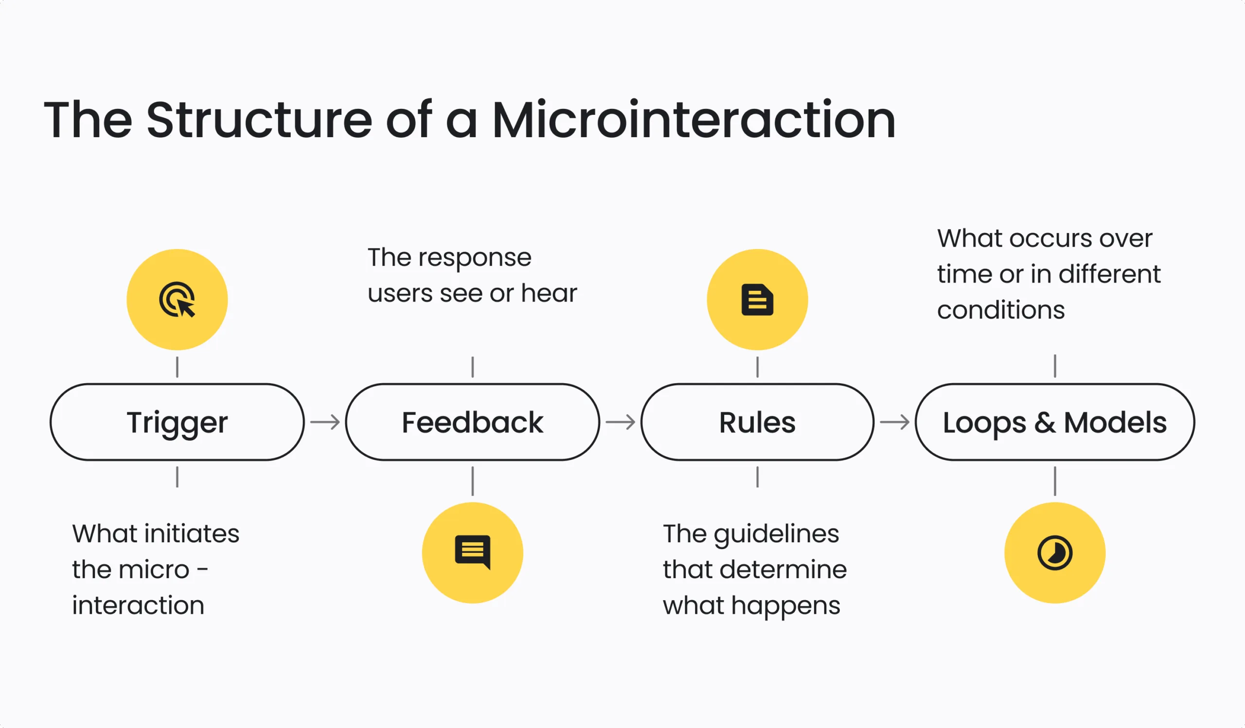
Every microinteraction is built from four key parts that work together to create a smooth, engaging user experience. Together, these components ensure microinteractions feel intentional, helpful, and delightful.

10 Website Microinteractions That Work
Let’s explore practical examples and how microinteractions can enhance the user experience:
1. Form Validation Feedback
Inline validation provides immediate feedback while users complete forms. For example, showing a green checkmark when an email format is correct or alerting users when a required field is missing.
Best practice: Use real-time validation to prevent errors rather than relying solely on error messages after form submission.
Tip: Pair color indicators with icons or text for accessibility.
2. Swipe Gestures
Swipe gestures simplify interactions on mobile devices. They let users dismiss notifications, navigate image galleries, or switch between sections with a natural motion.
Best practice: Make sure gestures are discoverable – don’t assume users will know they’re available. Provide hints or alternative controls.
3. Button Hover States
A subtle change in color, elevation, or icon when hovering over a button reassures users that the element is interactive. This tiny visual cue sets clear expectations, helping users feel confident about their next action.
Best practice: Ensure hover states have sufficient contrast and apply them consistently across your site.
Example: On the Council for Exceptional Children site, CTA buttons shift slightly on hover, drawing attention without overwhelming the user experience design.
4. Progress Indicators
Multi-step processes, like donation forms or membership signups, benefit from visible progress indicators. They help users understand where they are and what’s left, reducing anxiety and abandonment.
Example: A three-step donation form with clear labeling – Amount > Info > Confirm – keeps users oriented.
Best practice: Ensure indicators work well on mobile and use plain language (for example, “Step 1 of 3”).
5. Pull-to-Refresh Motion
Common in mobile apps, pull-to-refresh gestures paired with a satisfying animation give users control and make refreshing content feel natural.
Tip: Keep the animation simple to avoid performance lags.
6. Loading Animations
No one likes to wait, but waiting without feedback is worse. A simple spinner, skeleton screen, or progress bar can reassure users that something is happening in the background.
Best practice: Keep load times short, but when delays are unavoidable, use a loading animation to manage expectations.
Example: On donation or ticketing pages, progress bars reduce abandonment by showing users that their transaction is processing.
7. Password Reveal Toggles
A small eye icon that allows users to toggle password visibility is a simple but powerful usability enhancement. It prevents frustrating input errors – especially helpful on mobile.
Best practice: Always default to hidden and let users choose to reveal.
8. Scroll Animations
Scroll-triggered animations (like elements fading in or sliding up) add polish and keep users engaged as they move through your content. They can guide attention to key information without overwhelming the user.
Tip: Use scroll animations sparingly and test their impact on page load speed.
9. Micro-Copy Interactions
Micro-copy refers to small bits of helpful text that appear at just the right moment—for example, hints in form fields or playful messages that appear on hover.
Example: “Your password is safe with us” under a password field can build trust.
Best practice: Align tone with your brand voice and avoid clutter.
10. Notifications & Toast Messages
Quick, non-intrusive notifications (or toasts) provide immediate feedback – for example, “Your settings have been saved” or “Added to cart.” These messages confirm that actions were successful without breaking the user’s flow.
Best practice: Make sure toasts are dismissible and don’t block key content.
Common Pitfalls to Avoid
Even well-designed microinteractions can miss the mark. Here’s what to keep in mind:
- Overusing animation: Too much animation can overwhelm users and create a chaotic experience. Use animations sparingly and focus on moments that add real value.
- Impact on performance: Resource-heavy animations may slow down your site, especially on mobile devices or older hardware. Always test for speed and optimize your assets to ensure smooth performance.
- Inconsistent interactions: When buttons or elements behave differently across pages, it can confuse users and disrupt their experience. Establish clear design guidelines to maintain consistency throughout.
- Accessibility issues: Avoid relying solely on color to convey feedback. Ensure your microinteractions are accessible, supporting screen readers, keyboard navigation, and ARIA roles for an inclusive user experience. Check out our recent blog post on WCAG 2.2 Compliance outlining website accessibility best practices.
How to Get Started with Microinteractions
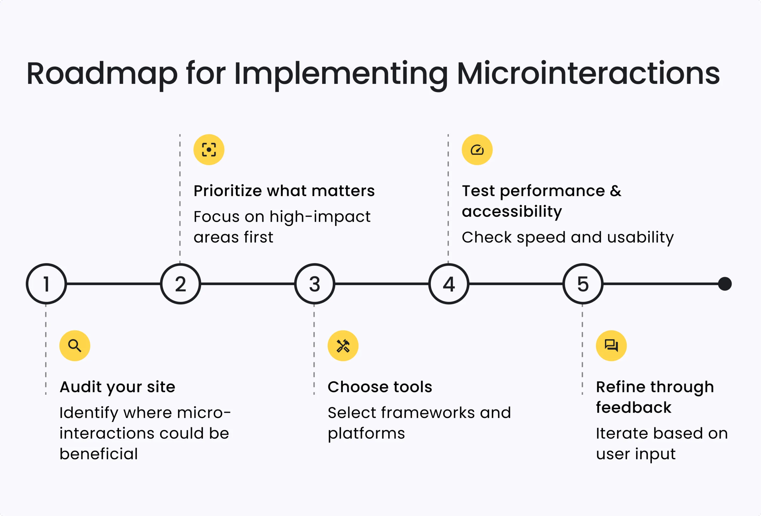
Microinteractions can elevate your website’s UX, but it’s important to approach them thoughtfully. Here’s a practical roadmap to guide you:
Step 1. Audit Your Site
Begin by identifying where users may feel lost or uncertain. Common areas include:
- Forms with high error or abandonment rates
- Buttons or CTAs that don’t stand out
- Slow-loading pages without visible feedback
Tools to help:
- Hotjar, Microsoft Clarity — Spot user drop-off points with heatmaps and session recordings
- Google Analytics — Pinpoint high-exit pages or form issues
Check out our blog post How to Perform a Successful Discovery of a Large Project for tips on identifying pain points and setting a strong foundation.
Step 2. Prioritize What Matters Most
Focus first on microinteractions that solve real pain points or enhance core tasks:
- Real-time form validation to reduce errors
- Loading indicators on donation, registration, or checkout pages
- Clear hover states for calls to action
Start small, measure the impact, and build from there. See our post Getting Started with Your First Website: Step-by-Step Roadmap for guidance on structuring digital projects and planning enhancements.
Step 3. Choose Tools That Fit Your Stack
Use frameworks and tools that balance ease of development with performance:
- Drupal: Webform Ajax (dynamic forms), Quicklink (faster transitions) See The Best Drupal Modules for Excellent User Experience to get proven module recommendations to strengthen your frontend.
- Design & prototyping: Figma, Adobe XD, Sketch
- UX Animations: Lottie (lightweight SVG animations), GSAP (advanced control)
Step 4. Test for Performance and Accessibility
Ensure microinteractions enhance the experience without slowing things down or excluding users:
- Use Lighthouse or WebPageTest to check speed
- Validate accessibility with axe DevTools or WAVE
- Support reduced motion preferences for users sensitive to animation
Step 5. Refine Through Feedback
Once live, monitor how microinteractions are performing:
- Are users completing forms more successfully?
- Is task abandonment dropping?
- Are key CTAs seeing better engagement?
Use data to adjust and improve over time.

Need Help to Get Started?
At Five Jars, we empower mission-driven organizations to create meaningful user experiences through powerful microinteractions that:
- Boost usability for smoother navigation
- Improve accessibility for all users
- Strengthen your brand’s unique identity
- Drive measurable, impactful results
Our team of UX designers, developers, and strategists works closely with you to audit your site, prototype innovative ideas, and deliver tailored solutions – whether you’re using Drupal, WordPress, or a custom platform.
Let’s make your digital presence work harder for your goals. Reach out for a free consultation to start transforming your website today!


