According to the CDC, 1 in 4 adults in the U.S. lives with a disability. That’s 61 million people. Globally, the number reaches over 1 billion. For nonprofits, schools, and associations, inaccessibility can mean excluding your very audience: supporters, students, and communities who rely on your services.
While this might sound like just a missed opportunity, it’s also a risk: legal, reputational, and ethical. With WCAG 2.2 compliance now the standard, those risks – and the opportunities to do better – are greater than ever. In this guide, we’ll break down what’s new in WCAG 2.2, outline website accessibility best practices, and show you how to achieve ADA website compliance while making your digital experiences more inclusive.
What’s New in WCAG 2.2
WCAG 2.2 builds on 2.1 by closing important gaps – especially for users with low vision, cognitive disabilities, and those navigating by keyboard or touch. Here’s a quick look at the new success criteria to focus on based on Web Content Accessibility Guidelines (WCAG) 2.2:
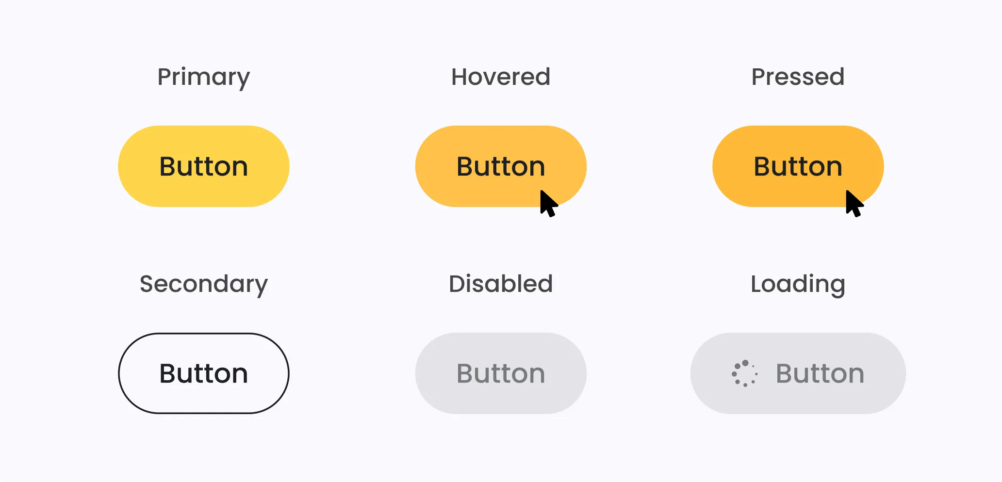
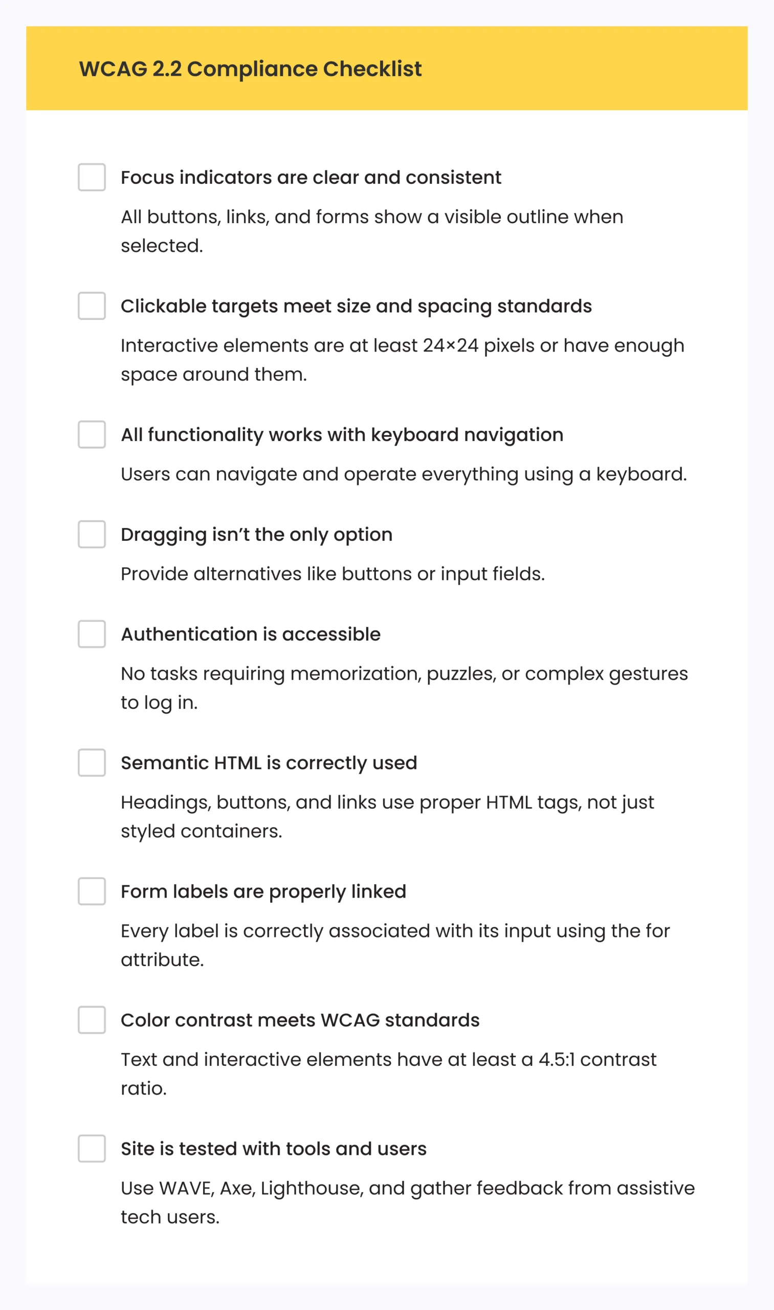
- Focus Appearance (Enhanced) – Focus indicators (the outlines that show where you are when tabbing through content) must be clearly visible. No more tiny, barely-there outlines that users can’t see.
- Dragging Movements – Interfaces that require dragging (think sliders or reordering lists) must offer an alternative, like up/down buttons or input fields.
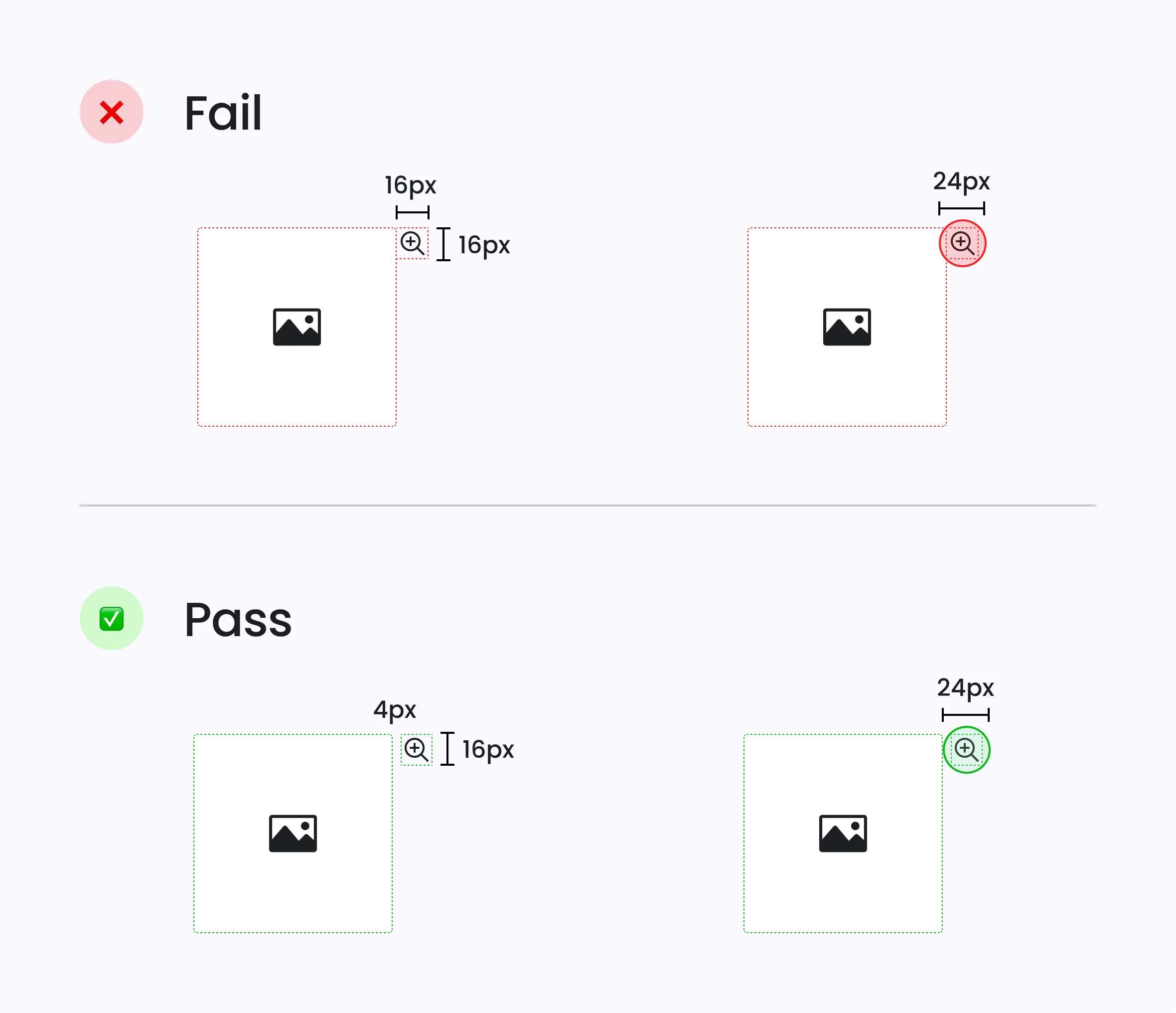
- Target Size (Minimum) – Clickable areas like buttons or links must meet a minimum size of 24×24 CSS pixels or have sufficient spacing.
- Accessible Authentication – Logins shouldn’t rely on memorizing passwords, solving puzzles, or similar tasks that create barriers.
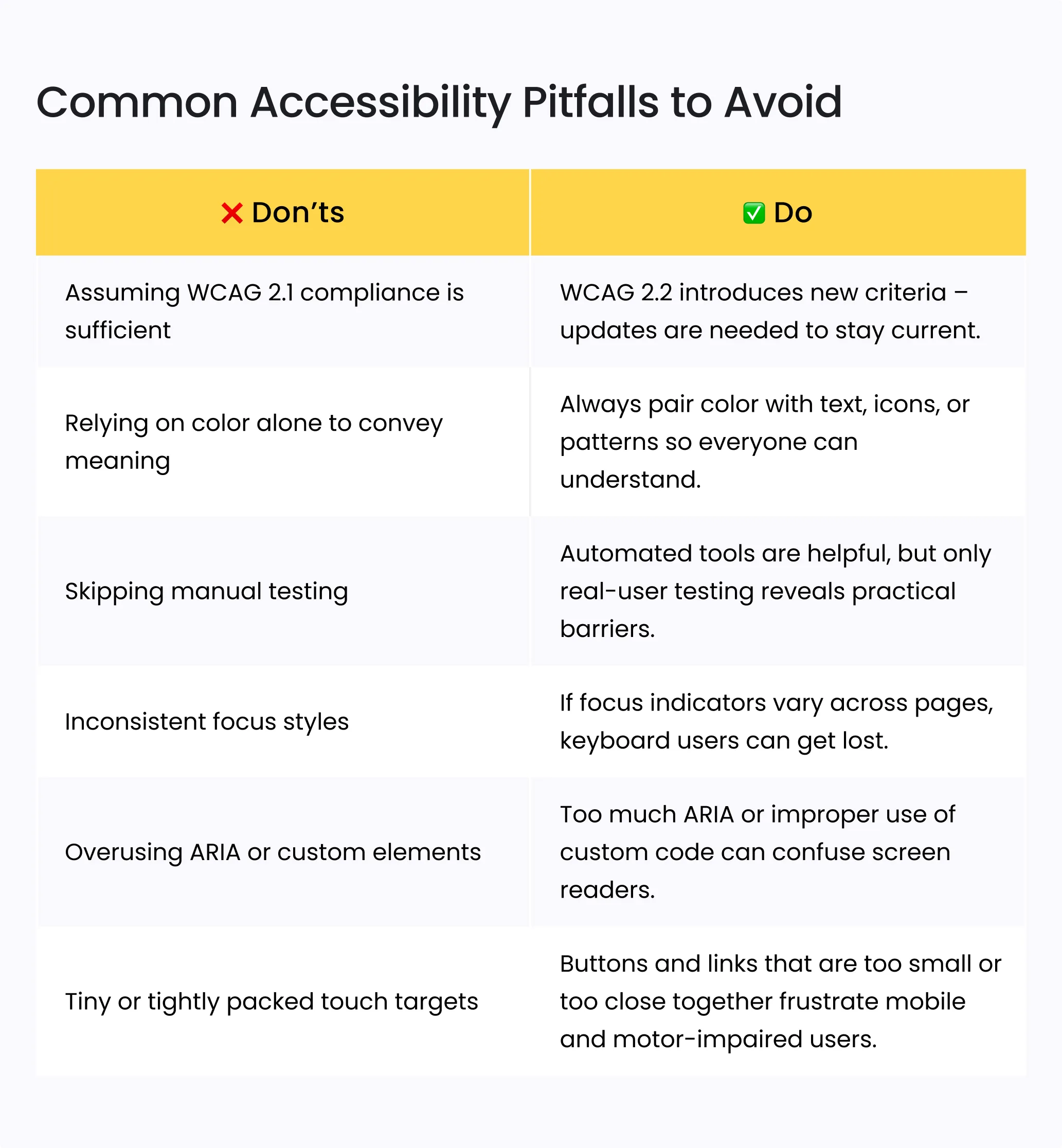
These updates mean organizations that were WCAG 2.1 compliant may no longer meet the latest standard without adjustments.
Best Practices to Ensure WCAG 2.2 Compliance
Let’s take these guidelines and break them down into clear, actionable steps that your web teams can easily follow to ensure a smoother implementation and better results.
#1 Clear, consistent focus indicators
Why it matters: Focus indicators help people who navigate with a keyboard or assistive tech see where they are on the page. Without them, users can get lost or unable to complete tasks.
Tip: Tab through your site and make sure every button, link, and form field shows a visible outline or highlight when selected.
#2 Keyboard-friendly navigation
Why it matters: Many users rely on keyboards rather than a mouse to navigate, especially people with motor disabilities or screen reader users.
Tip: Test key journeys – like completing a donation form or signing up for a newsletter –using only your keyboard.
#3 Minimum target size and spacing
Why it matters: Small buttons or links are hard to click or tap for users with limited dexterity or on small devices.
Tip: Ensure all interactive elements are at least 24×24 CSS pixels or have sufficient space around them to prevent accidental clicks.
#4 Alternatives to dragging movements
Why it matters: Drag-and-drop actions can be difficult or impossible for users with motor or vision impairments.
Tip: Provide buttons or input fields to reorder items, adjust sliders, or move elements – don’t require dragging as the only method.
#5 Accessible authentication
Why it matters: Memory-based tasks, puzzles, or complex CAPTCHA challenges create barriers for users with cognitive or vision disabilities.
Tip: Offer alternatives like magic links, password manager-friendly fields, or biometric logins.
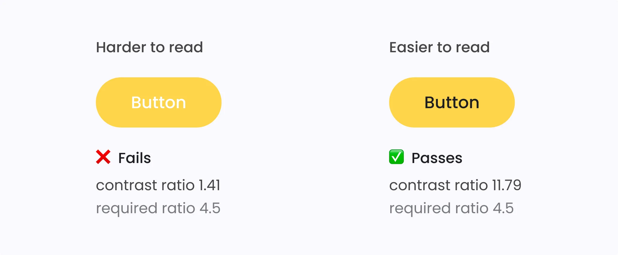
#6 Sufficient color contrast
Why it matters: Low contrast text or buttons can be unreadable for users with low vision or in bright environments.
Tip: Use tools like WAVE or Axe to check your site’s color contrast and aim for at least a 4.5:1 ratio for normal text.
#7 Semantic HTML structure
Why it matters: Proper tags (like <button>, <a>, <h1>) let screen readers and other assistive technologies interpret your site correctly.
Tip: Audit your code and replace generic <div> or <span> elements pretending to be buttons or links with proper semantic elements.
#8 Correct form labels
Why it matters: Linked labels and fields help users understand what to enter, especially with screen readers.
Tip: Make sure every form label uses a for attribute that matches the input’s id. Provide clear error messages that users can access via assistive tech.
#9 Testing with tools and people
Why it matters: Automated tools catch common issues, but only real users can uncover practical barriers.
Tip: Pair automated checks with usability testing that includes people who use assistive technologies.
WCAG 2.2 Compliance Tools and Resources
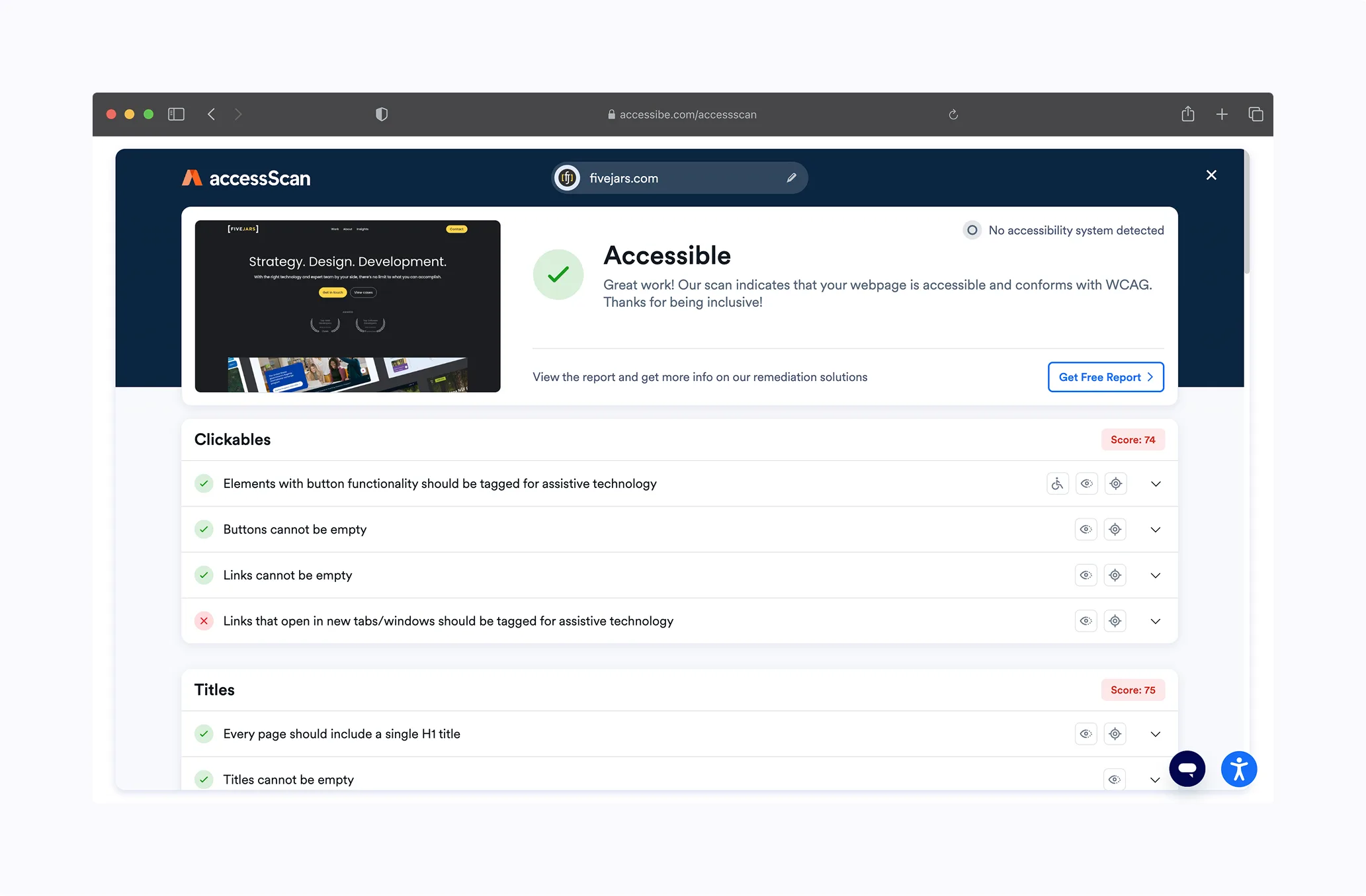
When creating accessible web design, having the right tools and resources at your side can make all the difference. Here are some trusted tools to help you with an accessibility audit:
🔹 WAVE (Web Accessibility Evaluation Tool) – Browser extension that flags common issues.
🔹 Axe by Deque – Free and paid solutions to integrate accessibility checks into your dev workflow.
🔹 Google Lighthouse – Built into Chrome DevTools; offers accessibility scoring.
If you’re curious about how to blend inclusive design with visually compelling branding, explore our recent blog post A Design View on Website Accessibility, and use the WCAG 2.2 Compliance Checklist below to ensure you address every critical detail.
Our Approach to Accessibility: Real-World Examples
At Five Jars, accessibility is more than just meeting guidelines or checking boxes – it’s about people. It’s about breaking down barriers so everyone can connect with your mission, contribute to your cause, and feel like they belong in your community. We’ve been fortunate to partner with organizations that embrace this vision.
George Washington’s Mount Vernon
Mount Vernon is a historic landmark dedicated to preserving American history. They wanted their digital presence to reflect the same inclusivity they champion onsite. When we teamed up, our mission was simple: ensure that everyone, whether visiting in person or online, has a seamless and welcoming experience. Together, we improved color contrast across their digital platform, enhanced keyboard navigation for users with motor disabilities, and simplified donation processes to make them accessible to all. Because supporting and learning from this national treasure should be open to everyone.
Council for Exceptional Children
The Council for Exceptional Children is an organization dedicated to supporting educators and families of children with disabilities. Their website needed to embody the same care and inclusivity as their mission. Working closely with their team, we applied inclusive design principles at every level. From creating a semantic structure to improve screen reader navigation to implementing focus indicators that guide keyboard users through complex pages, we built more than a compliant site – we created a digital space as supportive and empowering as the Council itself.
Moving from Compliance to Commitment
Compliance with WCAG 2.2 and the ADA is a starting point, not the finish line. Accessibility is not a one-time project; it’s a culture of inclusion that evolves as your digital presence grows.
When we make our websites accessible, we unlock opportunities. We invite millions more people into our digital spaces – people who want to engage, contribute, and belong.
What can you do next?
👉 Start with an audit. Use free tools, but go deeper with expert reviews and user testing.
👉 Prioritize fixes that have the biggest impact. Focus indicators, form labels, and keyboard navigation often deliver huge gains.
👉 Partner with experts. Whether you’re redesigning your site or improving an existing one, Five Jars can help you build accessible digital experiences that meet WCAG 2.2 compliance and support your mission.
Contact us for a consultation.
