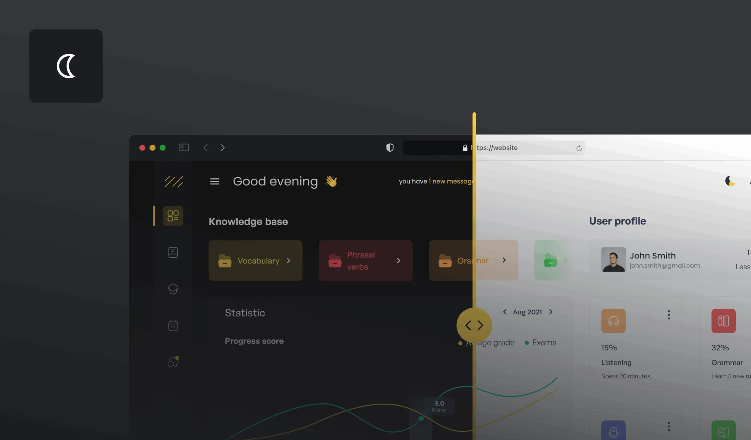
It’s 10 PM. You’ve been working on your app for hours, eyes tired from staring at the bright screen. Then, you switch to Dark Mode, and suddenly, everything feels better. That comforting low-light background lets you continue without squinting. It’s no wonder that dark mode is no longer a trendy option – it’s an essential feature in modern design.
As more people demand the option to switch to dark mode, creating the best experience for your users is key. But dark mode is not just about flipping a switch – it requires thoughtful design to ensure it serves your users well. In this article, we’ll explore 7 crucial design considerations to keep in mind when adding dark mode to your app or website. Let's dive in!
#1 Contrast is Key
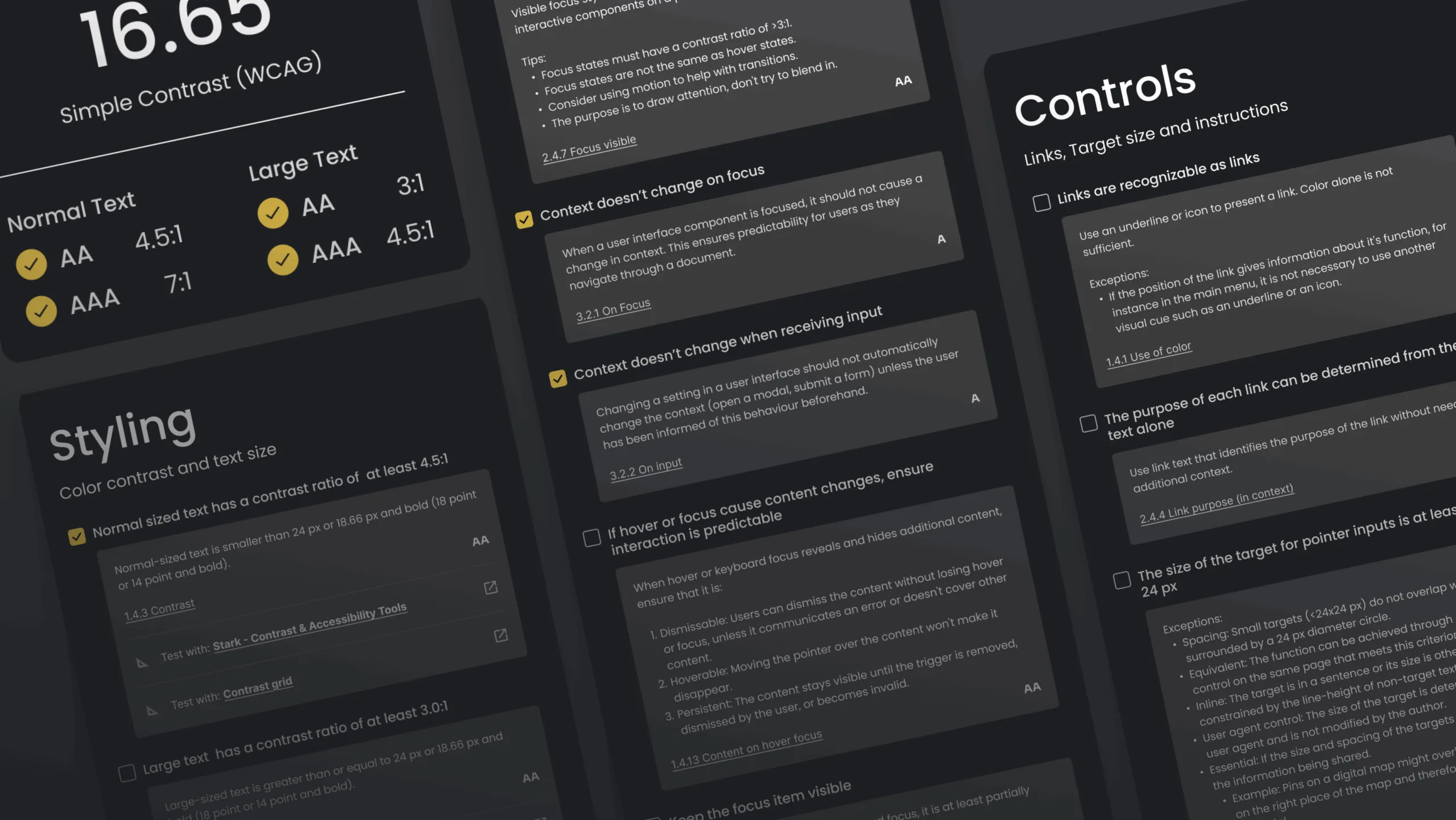
When designing dark mode, one of the most critical factors is contrast. The goal is to ensure that the text remains highly readable without causing eye strain. Maintaining an appropriate contrast level is essential for both readability and accessibility. This can be tricky, because a pure black background can often create too stark a contrast with white text, making it harder for users to focus. Additionally, it's important to ensure your color choices meet wcag's aa standard for color contrast to support accessibility for all users.
Instead of black, opt for dark grays or muted colors. Choosing the right color scheme helps avoid readability issues and ensures your interface is accessible. To dive deeper into accessibility best practices, check out our article on Designing for Web Accessibility.
When designing for dark mode, select a suitable color scheme and well-constructed color palettes to provide enough contrast and visual interest. Using less saturated colors can improve readability, especially against dark backgrounds. While true black (#000000) can be used selectively for elements like bezels or accents to enhance depth, a wider range of dark grays is generally better for backgrounds to maintain optimal contrast and visual differentiation. Choosing appropriate surface colors for backgrounds and text helps create visual hierarchy and depth in your design. High contrast ratios are necessary, but overdoing it can be just as harmful as too little contrast.
Pro Tip:
Use tools like the WebAIM Contrast Checker to test your contrast ratios and ensure compliance with accessibility standards like WCAG.
Real-World Example:
Slack gets this right with a soft dark gray background, which reduces eye strain. The text is white with plenty of contrast, making it easy to read without feeling harsh on the eyes.

#2 Eye Fatigue is Real – Go Easy on Bright Colors
It’s easy to get carried away with dark mode and use bright neon colors to make certain elements pop. But here’s the thing: too many bright, saturated colors can cause visual fatigue and distract users from what really matters: the content. Additionally, certain color combinations can visually vibrate, creating discomfort or a flickering effect that reduces accessibility and overall visual comfort.
When designing dark mode, aim for subtlety. Use bright accents sparingly, and focus on creating a balanced, smooth experience. Pops of color should be used for important calls to action, such as buttons or highlighted text. Ensure that brand colors are adapted for dark mode to maintain visibility and consistency, and choose appropriate color schemes that work well in dark environments. But avoid creating a rainbow effect in your dark theme.
Pro Tip:
If you want to test how bright colors will impact your design, try using tools like Colorable to evaluate color accessibility and visual comfort.
Real-World Example:
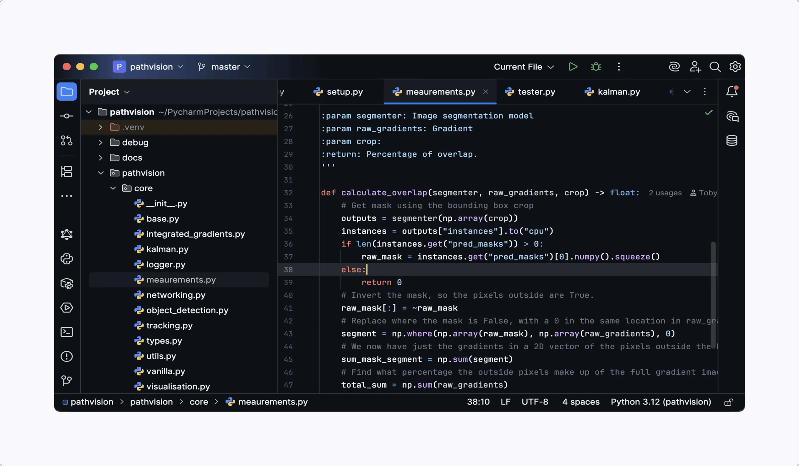
GitHub’s dark mode is a great example. The platform uses muted colors for syntax highlighting and minimal accents, making code easy to read without overwhelming the user with neon. GitHub's dark mode customization also lets users control the contrast and brightness, offering a tailored experience.
#3 Consistency Across Platforms
Whether your users are on desktop, mobile, or tablet, they should experience a consistent dark mode design across all devices. Inconsistent themes across platforms can confuse users and create a fragmented experience. Make sure that components and typography are styled consistently across platforms to maintain readability, accessibility, and a cohesive visual hierarchy. Additionally, use images that are tailored for dark mode to ensure visual consistency and enhance the overall user experience.
Dark mode should look just as polished and functional on a smartphone as it does on a desktop computer. Ensuring this consistency is vital for user retention and engagement.
Pro Tip:
Before releasing your dark mode feature, test across multiple devices to ensure the experience is the same. Emulators and browser developer tools can help you simulate dark mode on different screen sizes.
Real-World Example:
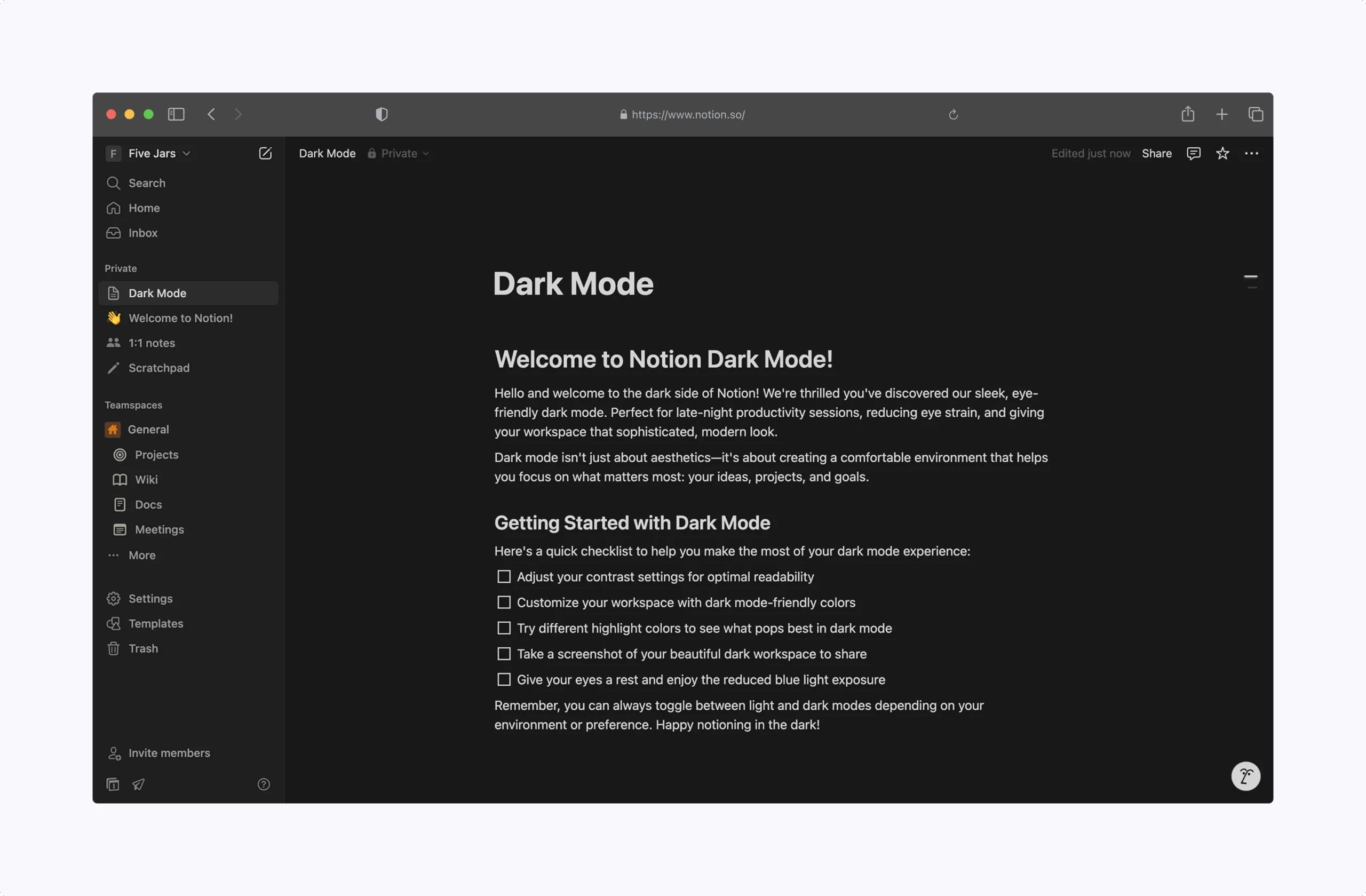
Notion does an excellent job with cross-platform consistency. Whether you’re on the mobile app or web app, Notion’s dark mode feels the same — with the same colors, smooth transitions, and easy readability. Notion also allows users to switch between modes quickly and seamlessly, offering full customization options.
#4 Don’t Forget About Accessibility
Dark mode isn’t just a feature for users with excellent eyesight; it can greatly benefit those with visual impairments or sensitivity to light. But for it to be accessible, you need to make sure that your design is more than just stylish — it has to be functional. Ensure that focus indicators are present and clearly visible in dark mode to help users identify their position on the interface. Additionally, pay close attention to typography, as effective typography is crucial for readability and accessible dark mode design.
For users with color blindness or low vision, ensure that you follow color accessibility guidelines. For example, avoid relying solely on color to convey meaning (e.g., making red text for errors), and consider offering high-contrast options for people who need it.
Pro Tip:
Screen readers and keyboard navigation should still work seamlessly in dark mode. Use accessibility tools like Axe to test your site or app for issues.
Real-World Example:
Apple’s macOS and iOS dark modes are known for their excellent accessibility features. They automatically adjust the contrast and ensure that text remains legible across different lighting conditions. They also work well with VoiceOver for visually impaired users.
#5 Subtlety is Powerful
Dark mode can feel elegant, sleek, and sophisticated when done right. However, you need to be mindful of excessive visual effects like shadows, glows, and sharp contrasts. Subtlety is your ally. Using well-defined edges and thoughtful space helps create separation between elements without relying on heavy effects.
Too much shadowing can make a simple interface feel heavy, and intense gradients can distract from your content. The best dark modes feel clean, with minimal distractions that allow the user to focus on the content. Microinteractions, when used sparingly, help highlight important elements without overwhelming the user. Learn more about how microinteractions contribute to seamless user experiences by reading our article on Website Microinteractions.
Pro Tip:
Use soft gradients and rounded corners to create a balanced aesthetic without overwhelming the user.
Real-World Example:
The messaging app WhatsApp nails subtlety in its dark mode. The background is a smooth dark gray, and the text is a soft white, allowing messages to pop out without becoming too harsh on the eyes.
#6 Consider User Control
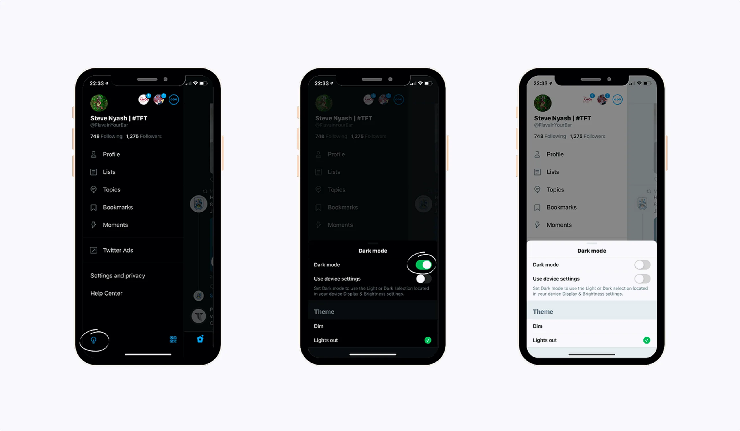
Offering users control over their theme is crucial. While dark mode is great for some users, others prefer the light mode interface. It's essential to let users toggle between modes based on their personal preferences.
Another consideration is saving user preferences. If a user switches to dark mode, they shouldn’t have to repeat that action every time they log in. Make sure your app or website remembers their choice.
Pro Tip:
Allow users to set dark mode automatically based on system settings. Many modern operating systems, such as Windows 10, macOS, and iOS, allow users to automatically switch between light and dark modes based on the time of day.
Real-World Example:
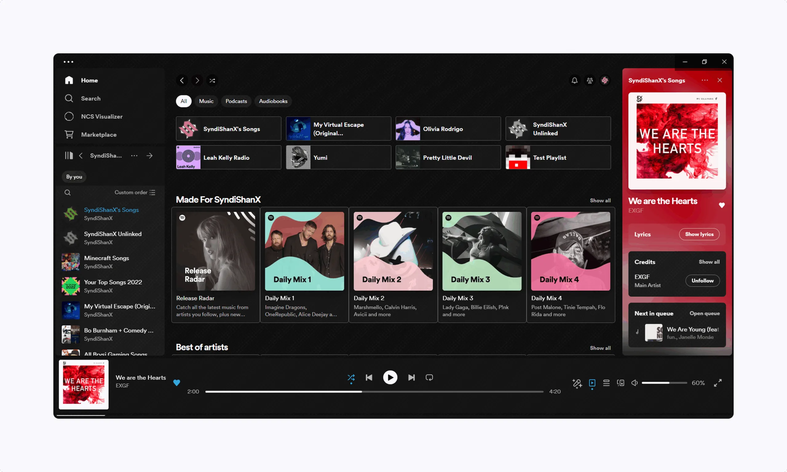
Spotify provides an excellent user-controlled dark mode experience. Users can toggle dark mode on or off through the settings, but it will also sync with their operating system preferences, ensuring that the experience is consistent.
#7 Test, Test, Test
The final and most important step? Testing. It’s easy to assume that dark mode will look great, but user testing is the only way to confirm it. Gather feedback from real users, and don’t just focus on your own opinions.
Testing in various environments (dim rooms, bright sunlight) and with a variety of users (with different visual abilities) is critical to ensuring the best possible experience.
Pro Tip:
Use A/B testing to compare your dark mode theme with the default light theme and get valuable insights on how users react to both options.
#8 Build a Clear Visual Hierarchy
A strong visual hierarchy is the backbone of effective dark mode UI design. In dark themes, it’s especially important to guide users’ eyes to the most important elements, since a dark background can easily flatten the interface if not handled thoughtfully. By strategically combining size, spacing, and a limited color palette, you can make sure that buttons, icons, and key information stand out without overwhelming the user.
Start by using predominantly dark surfaces as your foundation, then layer lighter surfaces or text to create contrast and clarity. Sparse color accents – such as your primary brand color – can be used to highlight calls to action or important icons, ensuring they stand out against the dark background. Remember, less is more: a limited color palette helps prevent visual clutter and keeps the interface elegant and easy to scan.
For example, you might use a slightly lighter shade for cards or elevated surfaces, while keeping the background a deep gray. Accent colors should be reserved for interactive elements, helping users quickly identify where to tap or click. By carefully crafting your dark mode color palette and considering how each element fits into the overall hierarchy, you’ll create a UI that’s both visually appealing and highly functional.
Pro Tip:
Don’t overload your dark mode interface with too many color choices. A limited color palette not only keeps things clean but also allows users to focus on what matters most.
#9 Style Words and Images for Dark Mode
Typography and imagery play an essential role in ensuring a successful dark mode UI. On dark backgrounds, it’s important that text remains crisp and readable, so opt for lighter shades like off-white or light gray instead of pure white. White text can often feel too harsh against a dark backdrop, making it difficult to read for extended periods. Select clear, legible fonts and consider adjusting font size and line height to enhance readability, particularly for users in low-light settings.
When working with images in dark mode, keep in mind that not all visuals will look great against a dark background. Images with low contrast or dark areas can easily blend into the background and lose definition. To make your visuals stand out, choose images with a higher contrast ratio and, if necessary, adjust their brightness or apply subtle outlines to enhance visibility. Pay attention to how your image color scheme interacts with the overall design – sometimes a small tweak can drastically improve how the image is perceived.
Pro Tip:
Always test your imagery and typography together to ensure they complement each other. A slight adjustment to image brightness or text color can go a long way in creating a clean, cohesive dark mode experience.
Real-World Example:
YouTube offers a great example of effective typography and imagery in dark mode. The platform uses light gray text that contrasts well with the darker background, preventing eye strain. Images, especially thumbnails, are designed with higher contrast to stand out against the dark background. This makes browsing videos more engaging without compromising readability.

Taking the Next Step: Perfecting Your Dark Mode Experience
Dark mode isn’t just a passing trend; it’s a powerful tool that, when designed thoughtfully, can enhance the overall user experience. By focusing on contrast, accessibility, and user control, you’ll create a more intuitive and inclusive design that your users will love. Whether you’re launching a new product or updating an existing one, these considerations will help you build a seamless, engaging interface. Additionally, dark mode can help extend battery life, especially on OLED screens, and is ideal for low light environments.
But the work doesn’t stop here. Testing, iteration, and gathering feedback are all essential to perfecting your dark mode design. Stay on top of best practices and follow dark theme ui design principles to ensure your product remains fresh, functional, and user-friendly. Advanced considerations include how to convey depth, create a sense of hierarchy, and make elevation apparent in dark mode. Use different shades to express elevation, distinguish elevation, and represent different elevation levels and elevation levels in the interface. Surfaces are illuminated differently based on the implied light source, which helps communicate depth and visually communicate depth throughout the UI. Choosing the right surface colors for each elevated surface is crucial, ensuring the lightest surfaces maintain readability and contrast.
If you’re looking to dive deeper into dark mode design or need guidance on refining your theme system, the team at Five Jars is here to help. We offer expert UI consulting to ensure your design is not only functional but also delivers a top-tier experience for your users.
Contact us today for a consultation, and let’s make your dark mode implementation easy for your team.
