Today I will give you a substantial review of a Layout Builder module, which has changed the way we display content with the visual layouts. It has replaced other modules that were popular on Drupal 7, such as Page Manager, Panels, Display Suite, and Panelizer. Now it is clear that the Layout Builder is the design tool of the future, and let me further explain why.
What Is Layout Builder
Layout builder is one of the Drupal modules that was launched as experimental in the 8.6 version and became stable in 8.8. It gives the opportunity to build page templates of different levels of difficulty due to its functional interface with the drag and drop and block adding features. Blocks can be created through the admin panel, or they can be custom based on code. You can add different views, blocks of fields, and more.
Advantages of the Layout Builder compared to the previous modules
- We can create the layouts both per entity and per node;
- We can add an unlimited number of layouts per page thus building pages of various structures;
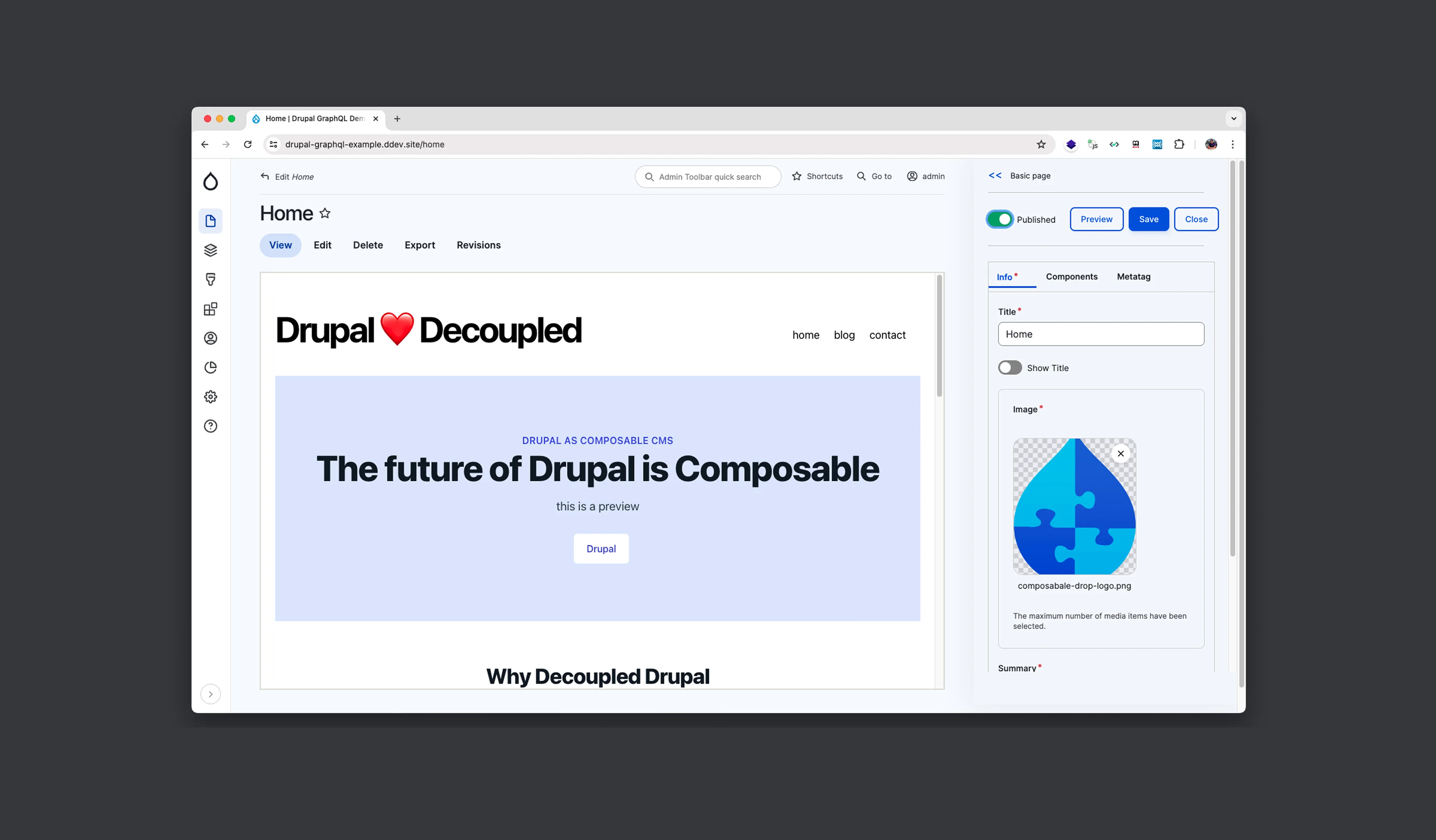
- It has a more user-friendly and flexible interface with the preview on the same page because the rendering happens in the frontend theme. It means that all our styles are applied immediately.
What Layout Builder Offers Out of the Box
First, we need to turn on 2 modules, Layout Builder and Layout Builder Discovery.
On the Manage Display tab, we need to activate the checkbox Use Layout Builder, and after this, we permit to customize layouts of each content item. Once you do this, you get access to the Manage Layout section.
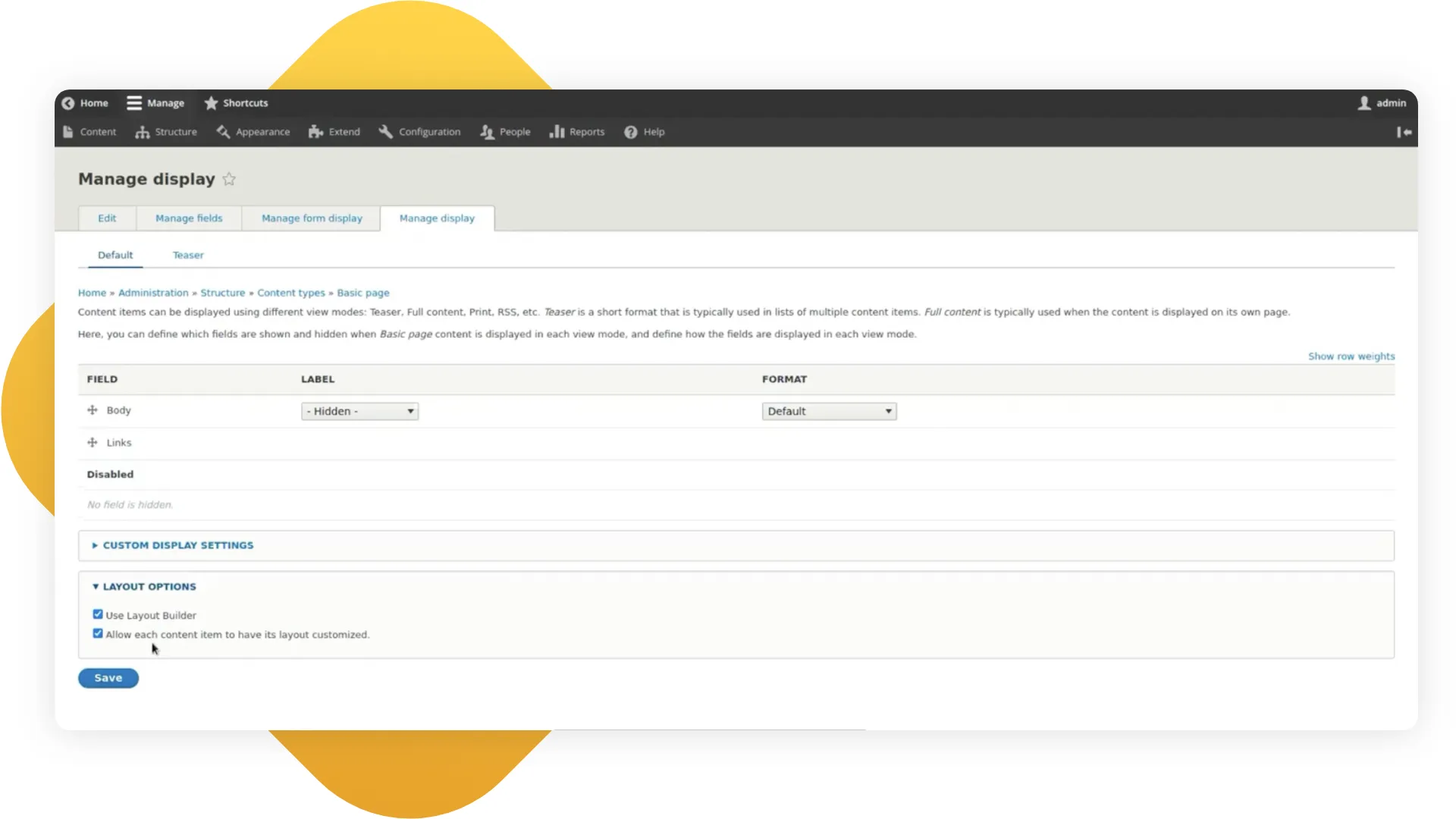
In the Manage Layout section we create the default layout for all the pages that we are going to build in the future. It will be possible for the content manager to change it later for each node.
As you add a block, you get a huge list of the more or less useless block types, some of them come in handy though, such as the Content field block type.
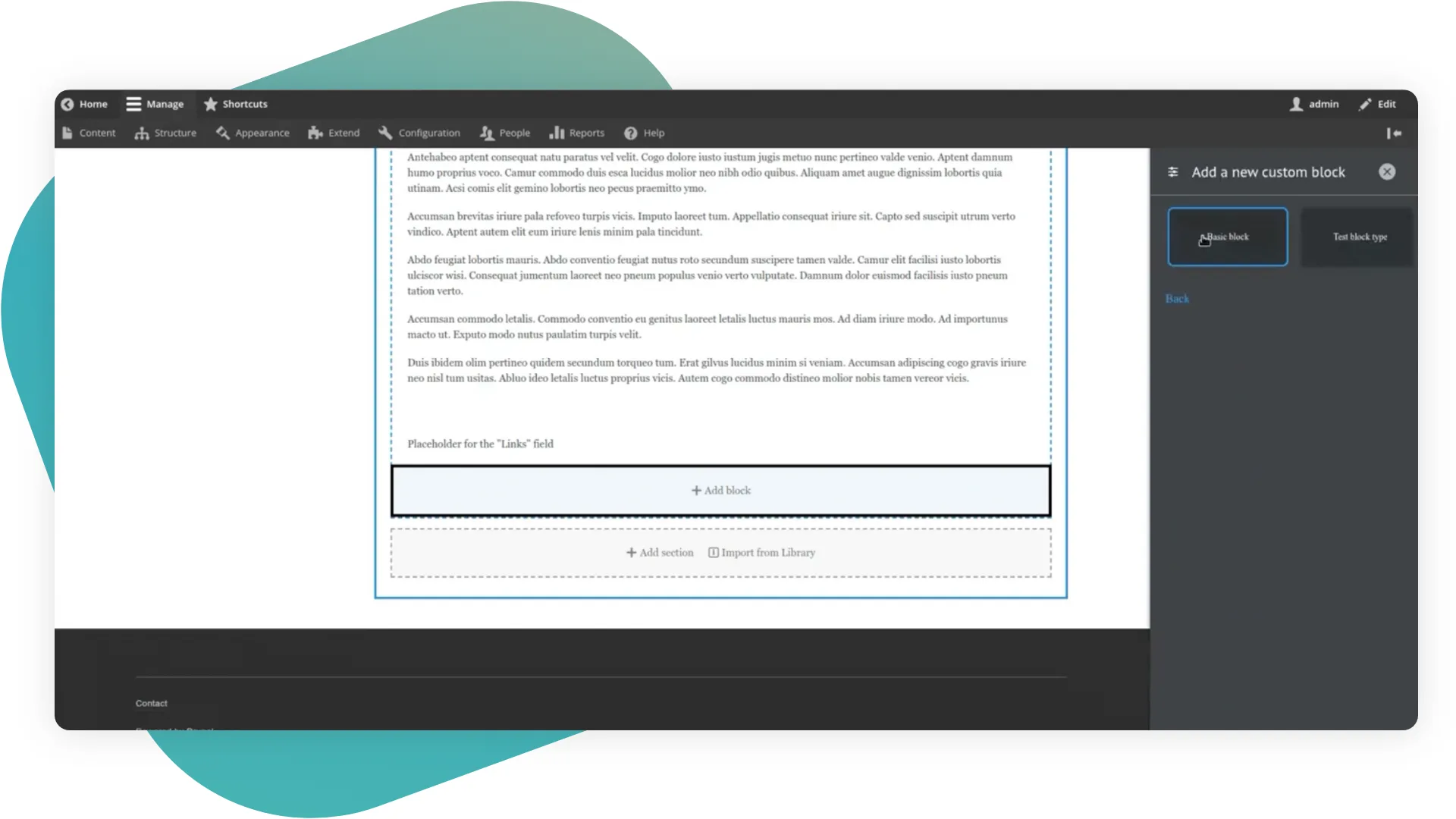
We have a Create Custom Block button. In the section, all custom blocks built through the admin panel will be displayed.
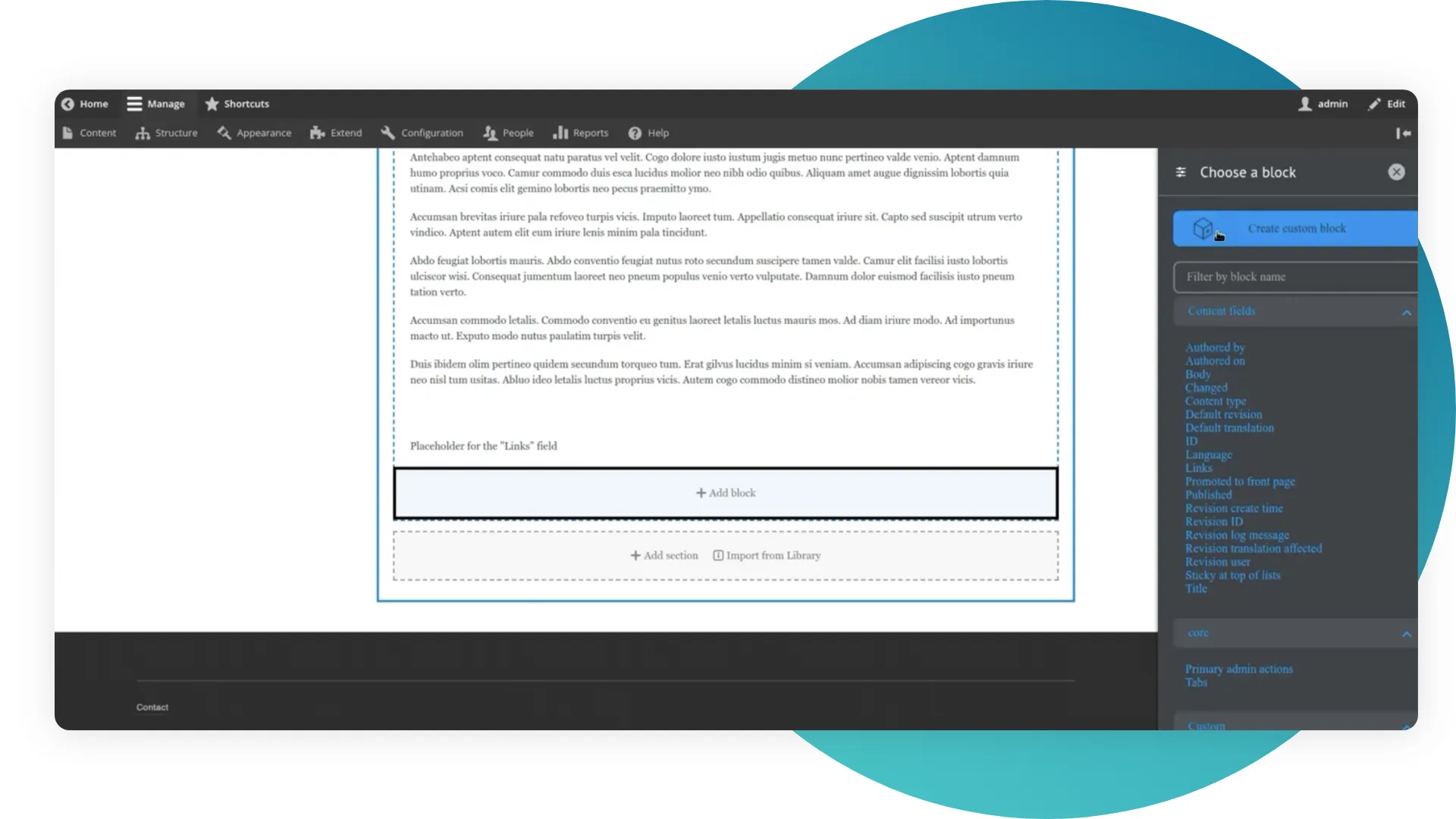
It is worth noting that all the blocks created with the layout builder here are labeled as ‘reusable: false’. And they will be accessible only in this node. They will be displayed neither in the layout nor in the list of all blocks. You can only find them in this context menu.
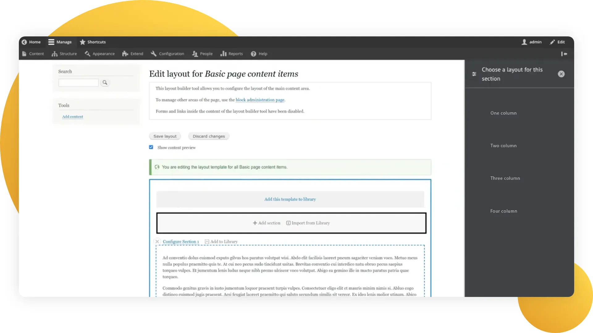
In the box we have 4 layouts, which you can reach through the Add Section:
- One column;
- Two column;
- Three column;
- Four column.
The styles in the box are a bit broken, and we will talk about this later.
But it will be quite enough if you set them up based on the width of each block. All of them are responsive to mobile. It works well, though not perfectly.
What else do we have in the box?
While adding a block, such as an Image block, we will see a widget for this field. There you will be able to choose the format. For example, in the Image block, it offers two options: URL to the image, and image upload.
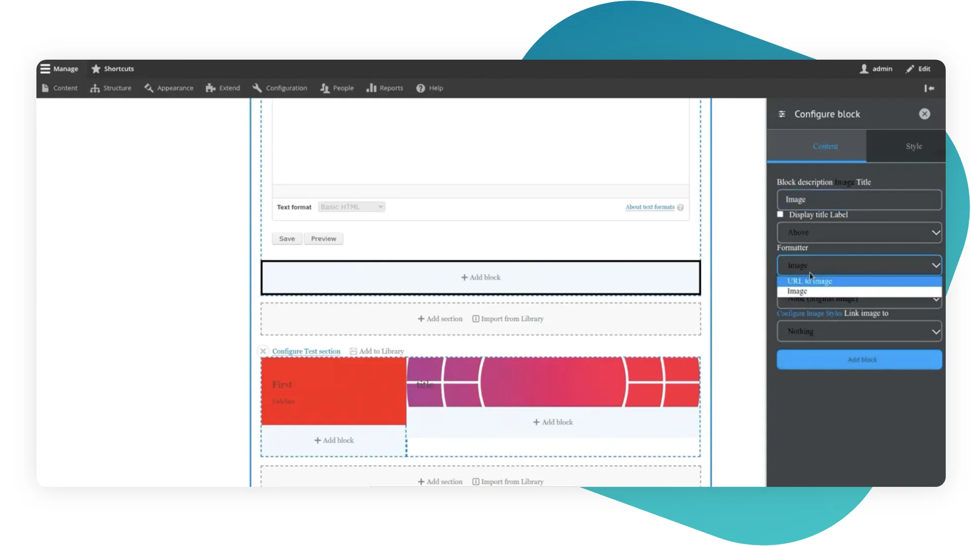
From my own experience, I would suggest hiding all of these settings from the end client, because we had cases of page crashes when our client tried to change them. Such as if accidentally, the client goes to the node and tries to display the same node with the same settings in the view mode, the display will be caught in an endless loop, thus it won’t work.
In general, this is everything that the Layout Builder module offers out of the box. Although it’s more than enough for work, we will take a look at some additional modules, because they help make the true magic.
Additional modules
Bootstrap Layout Builder
This is the module we like most. What’s so good about it?
Out of the box, this module gives us 12 templates for the sections for each Bootstrap column. You cannot build your layouts through the admin panel, but you can easily do this through copying configurations.
Default configuration example
uuid: d1d7005a-2870-4cb3-8e4e-13b15704c932
langcode: en
status: true
dependencies: {  }
_core:
      default_config_hash: _hceF2FU-cW_IhsB2zVkKT-Q032QmEayRhecbAQwGbk
id: blb_col_1
label: 'Bootstrap 1 Col'
number_of_columns: '1'
Our configuration example
uuid: 781d4cbb-5a3d-4810-a248-9a765ada014f
langcode: en
status: true
dependencies: {  }
id: blb_col_1_narrow
label: 'Bootstrap 1 Col (Narrow)'
number_of_columns: '1
In our configuration we changed the id, then we picked the number of columns. We do this to use all of the advantages of the module. Bootstrap gives 12 columns, but we often have situations when one column should be narrower, or when the columns should be arranged unusually, such as here:
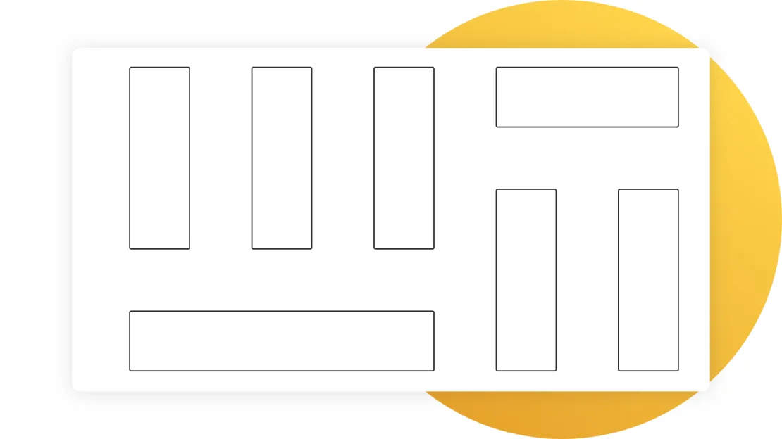
In this situation, we just copy the configuration and rewrite the template for this section.
Let’s go to the sections. We pick a section of 4 columns.
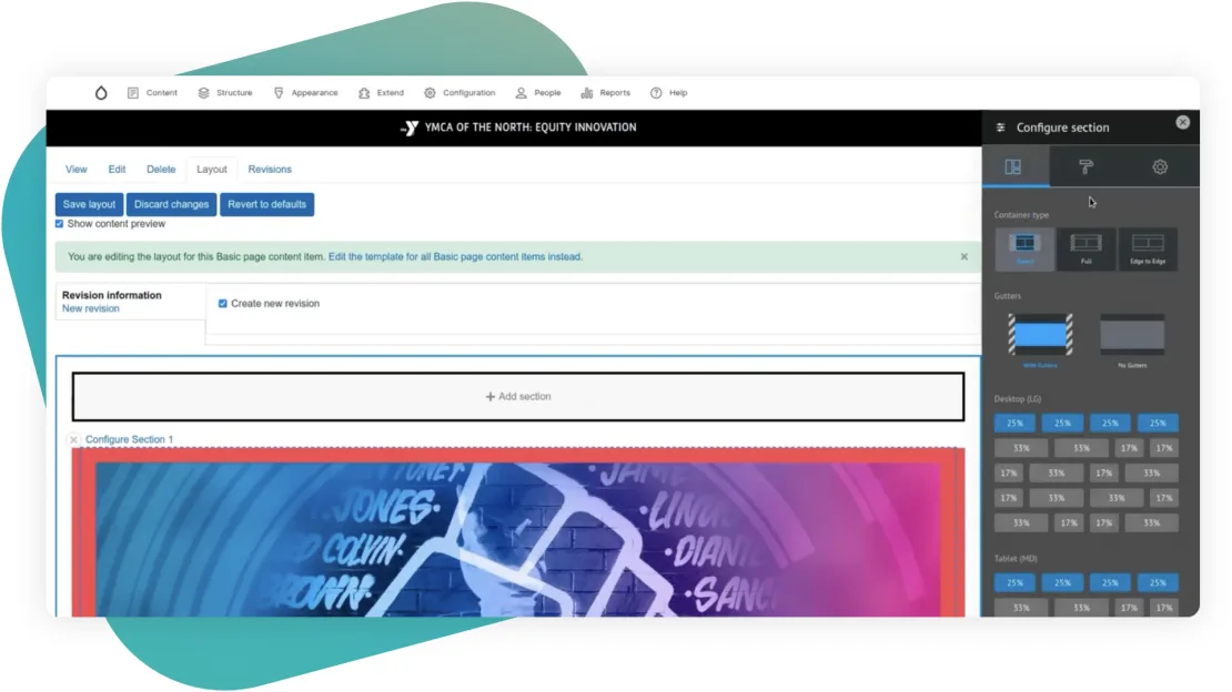
Out of the box, Container Type allows us to configure all Bootstrap settings, which it gives for containers, rows, and other elements. In this example, we have a 4 column template, and we can choose how it will be displayed on each of the screen types. We can regulate what width will be assigned to each block. Plus, we can pick the width of the container in this section.
We have the option to make a Boxed container type or a Full container type, but then we’ll have a small indent. Finally, we can just remove any width settings, and leave it Edge-to-Edge. Besides, we can also remove small Bootstrap gutters.
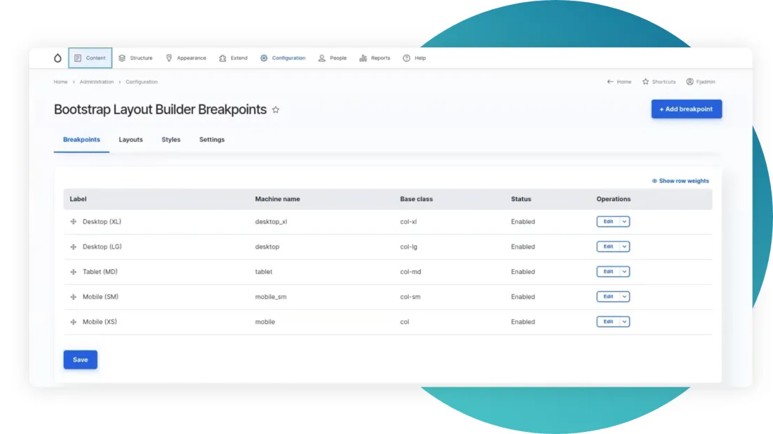
By default, we have 3 breakpoints: desktop, tablet, and mobile. You can easily add more, just like you see 5 of them on the screenshot above.
On the page of the Layout Builder, we regulate how the section will display under each breakpoint, as well as we can regulate the width, or create custom widths.
If we go to the layouts tab, we will see all our layouts.
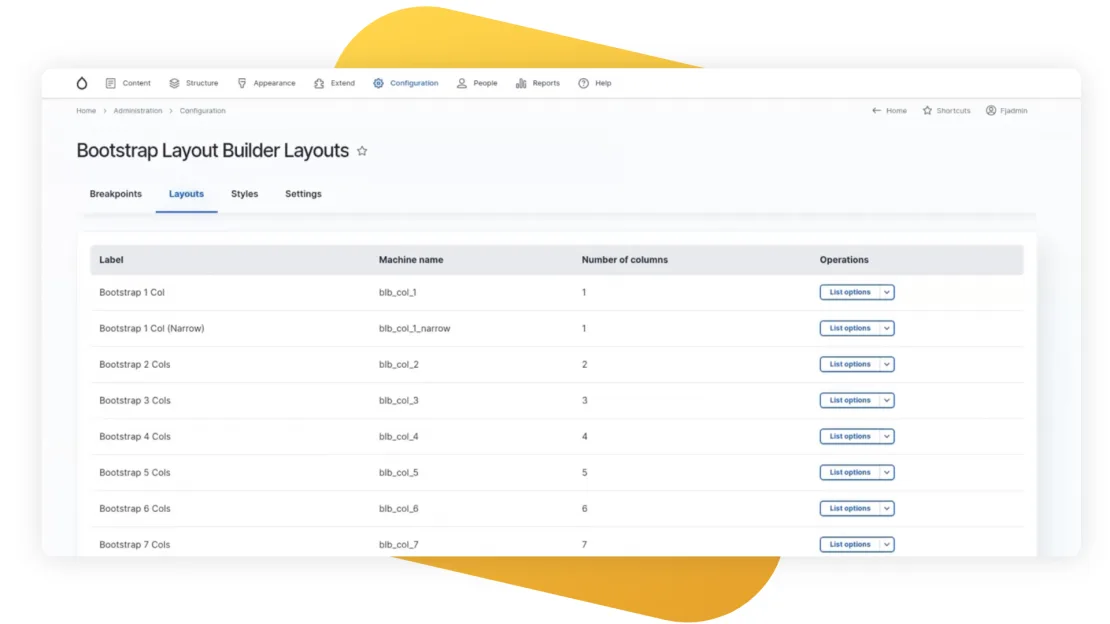
Here you can pick any of the existing layouts and view the layout options.
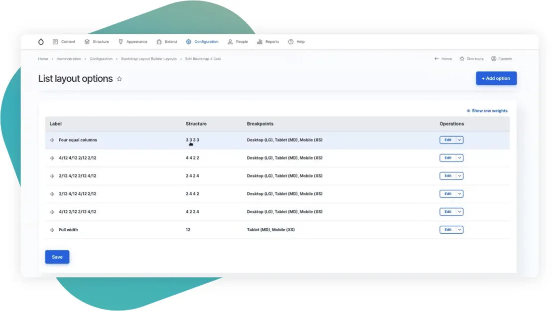
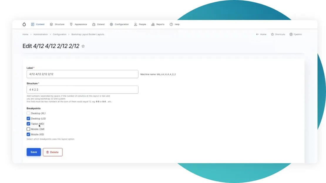
Edit them.
Or add the new ones.
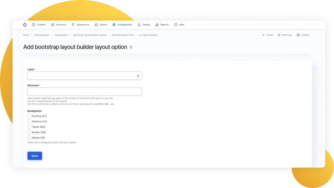
Note that when you add the structure, it should be equal to 12 columns available.
Bootstrap Styles
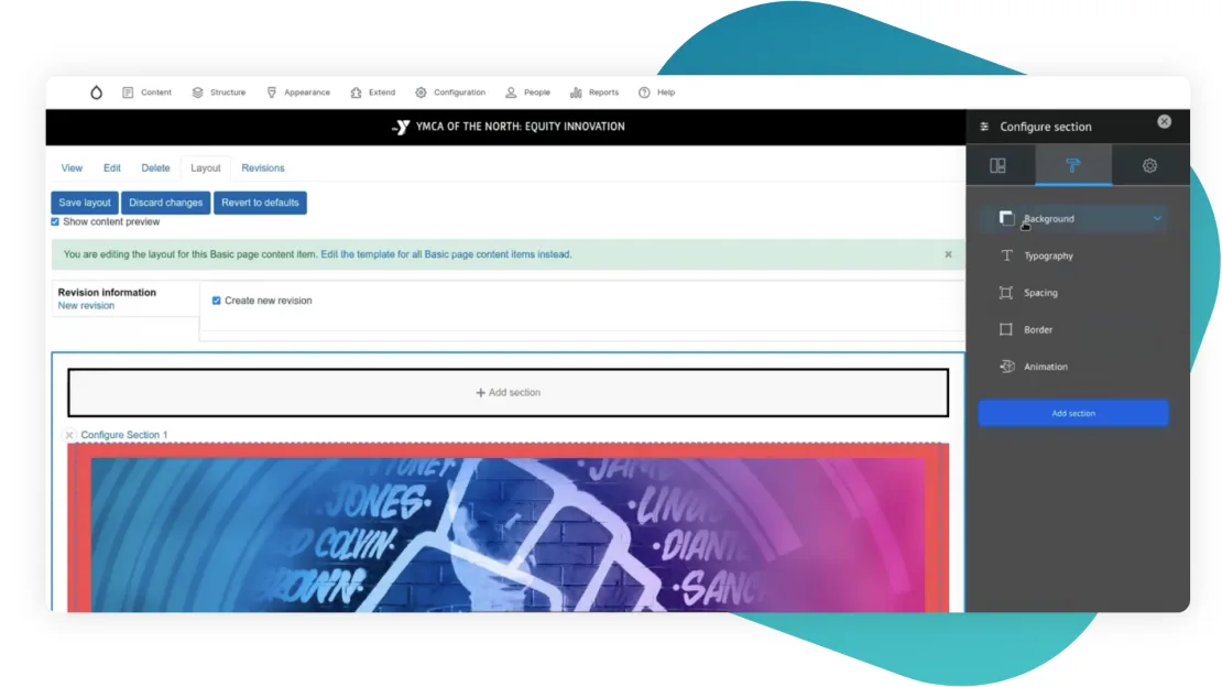
In Styles we can configure such settings as:
- background (colors, images, filling, video);
- typography (text color, alignment);
- spacing (margin, padding);
- border (style, width, color, radius);
- animation (scroll effects).
The same things can be edited using classes on the Bootstrap Styles Settings tab. First, you need to write a CSS rule, and then insert it in the corresponding section.
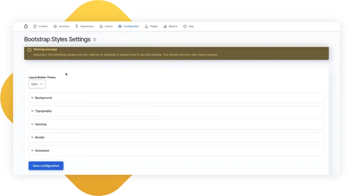
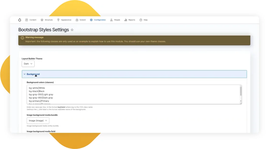
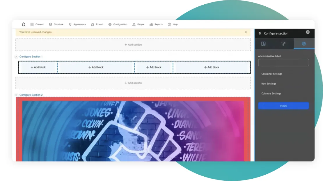
Next to the Styles, we have a Settings tab, where we can regulate additional Container settings, Row settings, and Column settings. It’s much better to make it in the admin panel because you won’t need to re-write the template.
Layout Builder Browser
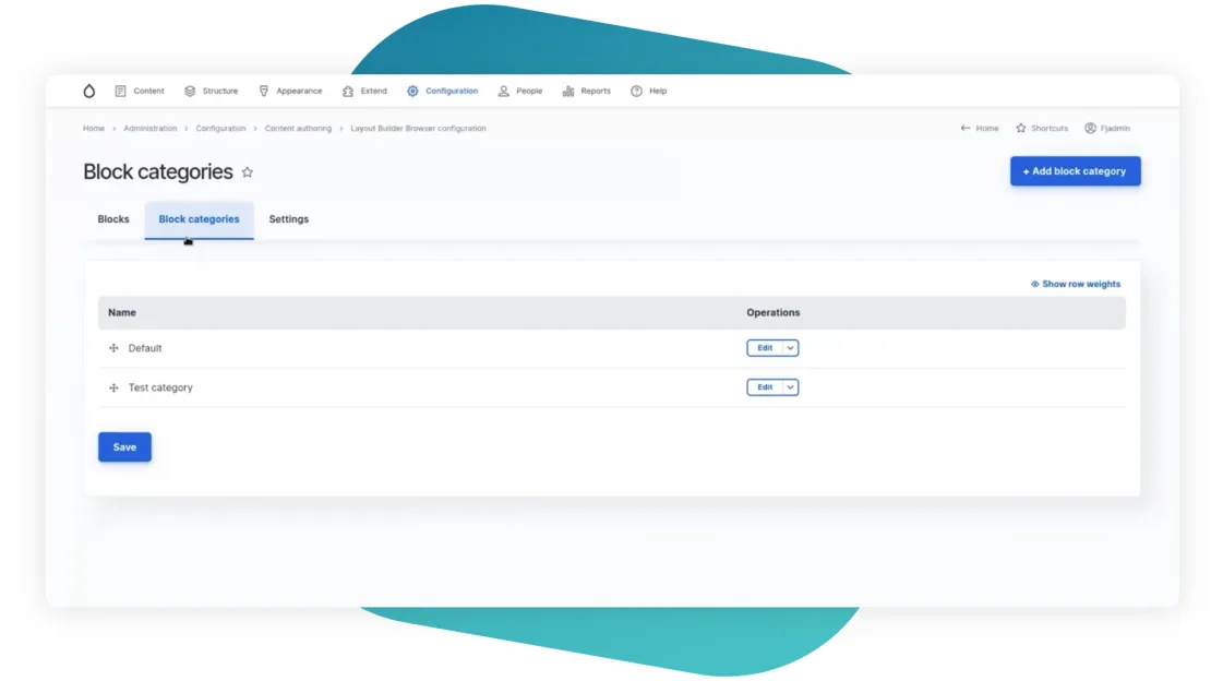
This module helps replace all these endless blocks available by default. Here we can create categories, and we can add our own blocks.
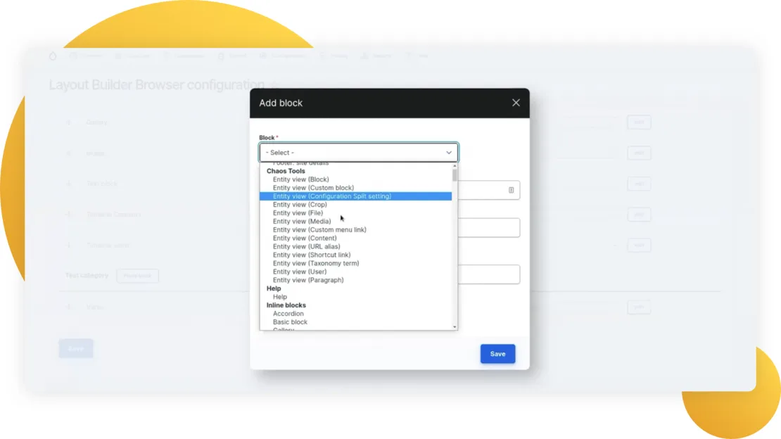
Just go to the Add block and the drop-down with all the options will be available.
Layout Builder Modal
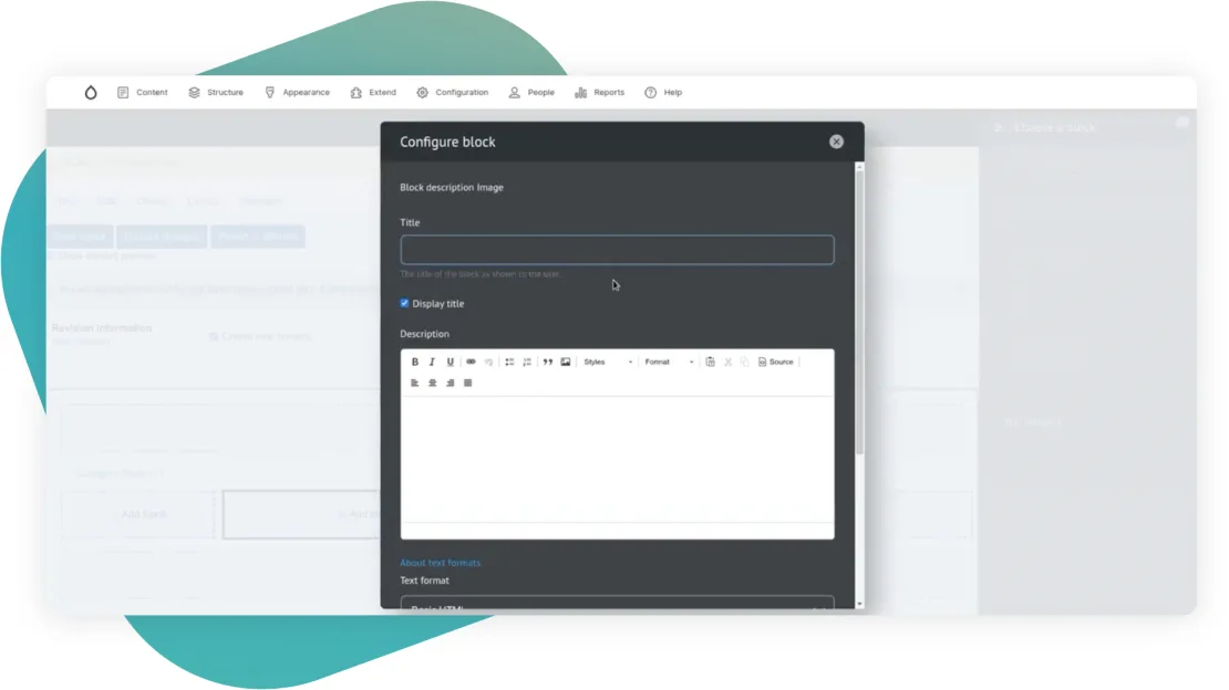
A truly useful module. When the block is added, it’s shown up as a popup on the same page. No page reloads are needed to view the result immediately on the same page.
These were 4 additional modules, which make the Layout Builder so powerful.
Other useful modules include:
- Media Library Theme Reset - makes content editing easier and more effective by moving the entire layout building process to the backend theme. It loads theme 7 and applies it to all the forms used in the layout builder. The solution is controversial, but It does make good-looking forms, which are much better than in the frontend theme.
- Section Library/Layout Builder Library - help save the sections and templates in the library and reuse them later on the same or another page. The difference between these two is that the Section library creates a content entity for the templates, and the Layout Builder Library creates a config entity, which you should consider while deploying.
- Layout Builder Blocks - similar to Bootstrap Layout Builder. It has the same magical functionality but at the block level.
- Layout Builder Kit/Layout Components - give ready components, and blocks created by plugins. Give opportunities to display nodes, media, text, images, videos, and other content types. These modules are handy for those who have little experience with Drupal, for small-size projects, or just for those who want to try Layout Builder. These two modules are for sure a good start.
- Layout Builder Restrictions/Block List Override - the first one defines which blocks should be available for allocation in the layout builder for each node/type, and Block List Override removes some blocks from the website entirely. From the layout, all the lists, everywhere. You can use these two modules together for the Layout Builder Browser module as they are similar in functionality.
- Layout Builder Lock - with this module we can forbid deleting/moving/updating/changing configurations for blocks and sections, or forbid changing the default blocks.
- Layout Builder Component Attributes - adds attributes (ids, classes, styles, data attributes for blocks/titles/contents).
- Radix Layout - gives a huge number of layouts for sections. About 20 different layouts are available. Due to this variety of templates, the module can be a good start and an alternative to Bootstrap Layout Builder.
- Layout Builder UX/Layout Builder Quick Add - helps improve UI a bit, such as adding context menus, and allowing better drag and drop functionality. Both modules are in beta now.
- Block Form Alter - an easy module, which gives two hooks for the alter block, which is added to the layout builder. Let’s view them below.
Useful hooks for the Layout Builder
Block Form Alter module, the last one mentioned in the list above, offers two hooks:
hook_block_plugin_form_alter() - for those blocks that we write through a plugin system.
hook_block_type_form_alter() - for those blocks that we create through the admin panel.
hook_plugin_filter_TYPE__CONSUMER_alter(
      array &$definitions,
      array $extra
)
eiclp_master_plugin_filter_layout__layout_builder_alter()
All layouts are stored in definitions. With this hook, we can easily exclude the layouts we don’t need in the container. You can make it with the Layout Builder Restrictions or Block List Override modules that we viewed earlier, but this is a quicker option with just 10 lines of code.
Custom layouts
Though with such an impressive number of modules, it’s hard to imagine why and when you will need to have custom layouts, it’s still useful to know how to create them in case you need them.
There are two ways to create custom layouts:
*.layouts.yml
layout_id:
      label: Layout 1
      category: My Layouts
      template: templates/advanced-layout-2
      library: MY_MODULE_OR_THEME/advanced-layout-library
      regions:
            main:
                  label: Main content
      icon_map:
            -[square_one, square_two, square_three]
            -[rectangle_vertical, rectangle_horizontal, rectangle_horizontal]
            -[rectangle_vertical, square_four, square_five]
PHP class
class MyLayoutClass extends LayoutDefault implements PluginFormInterface
{
        defaultConfiguration();
        buildConfigurationForm();
        validateConfigurationForm();
        submitConfigurationForm();
}
*.layouts.yml
custom_layout:
      label: layout 2
      category: My Layouts
      class: '\Drupal\my_custom_module\MyLayoutClass'
      template: templates/advanced-layout-3
      regions:
            main:
                 label: Main content
TWIG template
<div class="custom-layout {{ settings.extra_classes }}">
      <div class="main-region">
            {{ content.main }}
      </div>
</div>
Troubleshooting
Styles
As we saw earlier, you can face some problems with the out-of-the-box styles. Also if you use several contributing modules, each will add its own set of styles, covering each other. Any bug can be easily solved either with a patch or as long as we render a layout builder in the frontend theme, we can predetermine it all.
Conclusion
My opinion is that layout builder is more convenient and it gives more opportunities for editing compared to the very popular Paragraphs module, even though Paragraphs has a more powerful ecosystem, I am confident that the future will be driven by the Layout Builder.
