How can we make their experience similar to the majority of users?
Imagine an ideal world where every website user sees it the way you do: with perfect brand colors, engaging images, modern videos, and can use all the buttons and forms on the website.
Wouldn’t it be great?
Well, at this moment, reality knocks on your door, as 1 in 5 people live with a disability that impacts their web experience. This means that 1 in 5 people can’t see your perfect brand colors, can’t view an image or video, or can’t use a form or button on your website.
The question is, how can we make their experience similar to the majority of users?
What is Web Accessibility?
First thing first, what is website accessibility? Similar to real life, we must provide equal opportunities for all users. For example, every Americans with Disabilities Act (ADA) compliant building in the U.S. must have a wheelchair ramp. Similar to this experience, there are rules that must be applied to your website.
Web accessibility means designing websites so that everyone, including people with disabilities, can use and interact with them. Disabilities that can affect web access include visual, auditory, motor, and cognitive impairments. For example, a visually impaired user might rely on a screen reader to navigate your site, while someone with limited mobility may need to use a keyboard instead of a mouse.
At its core, accessibility is about removing barriers. The Web Content Accessibility Guidelines (WCAG) serve as the gold standard for creating accessible websites. They outline how to make websites perceivable, operable, understandable, and robust—all essential components of an inclusive design.
Accessibility From a Design Perspective
Good design isn’t just about aesthetics; it’s about functionality:
Color, contrast, and visual simulation
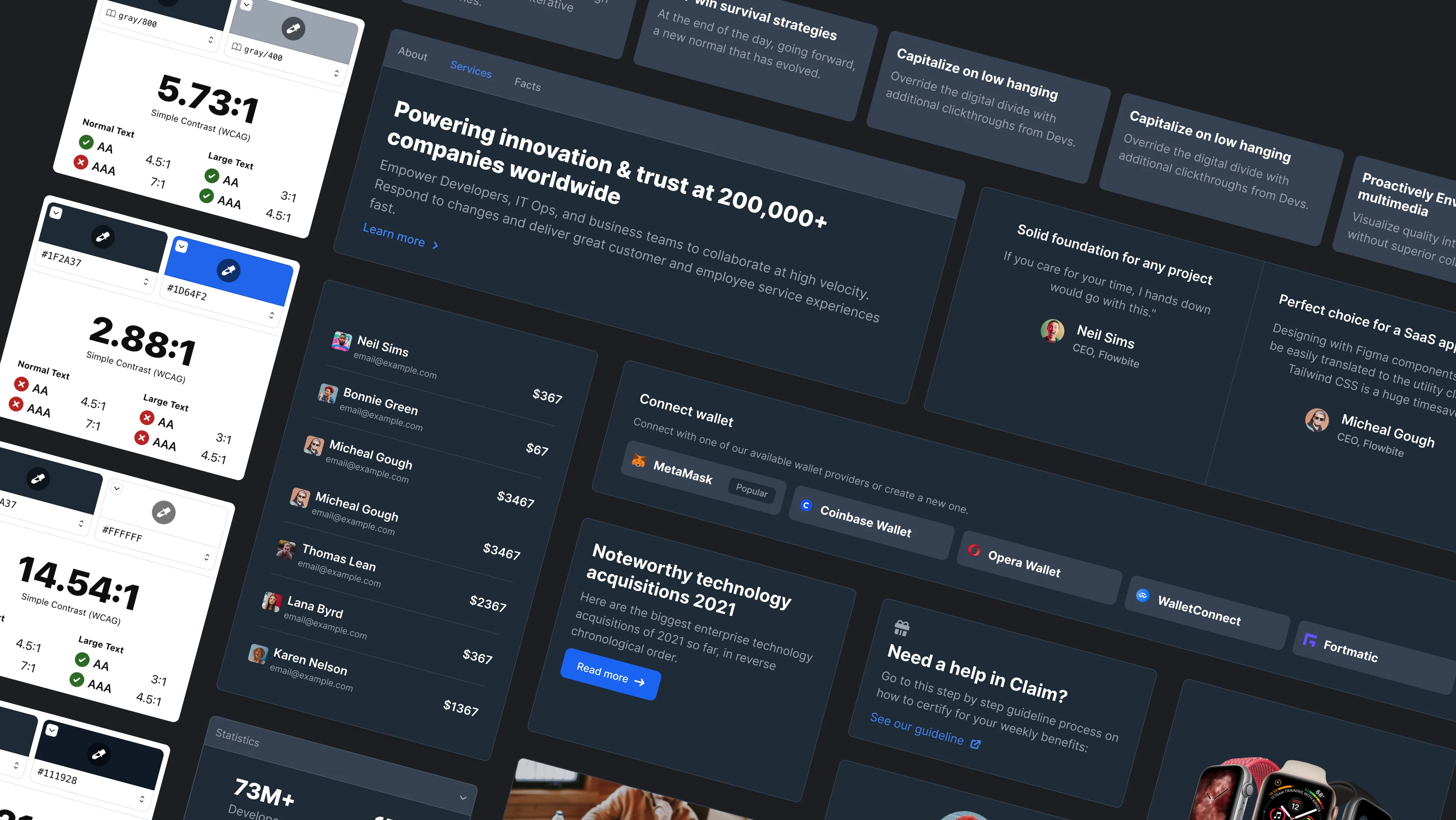
There are different types of visual issues, such as protanopia, deuteranopia, tritanopia, achromatopsia, loss of contrast, ghosting, and more. The simplest way to make your website accessible is to choose contrast colors. How to ensure that your colors are contrast enough? There are a lot of different services out there that help you check it. Our favorites are:
What these services do: They compare two colors and tell you if they are accessible enough or not. As simple as that.

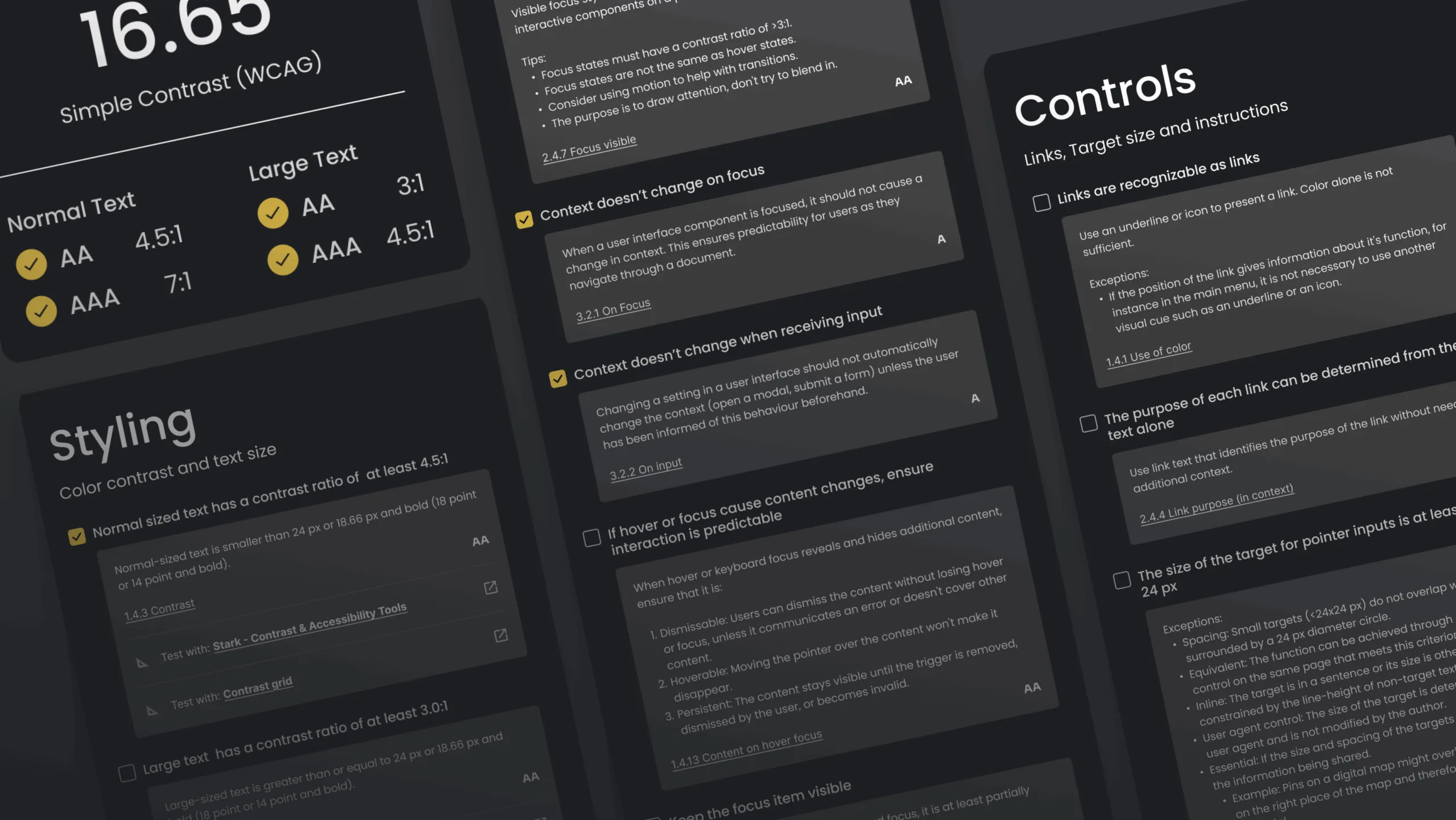
The aimed numbers to make your colors contrast against each other are:
- Large text (at 14 pt bold/18 pt regular and up) and graphics should be 3:1 against the background
- Small text: 4.5:1 against the background
- A good middle ground is to aim for a 7:1 contrast ratio, the AAA rating for WCAG
Visual Simulation
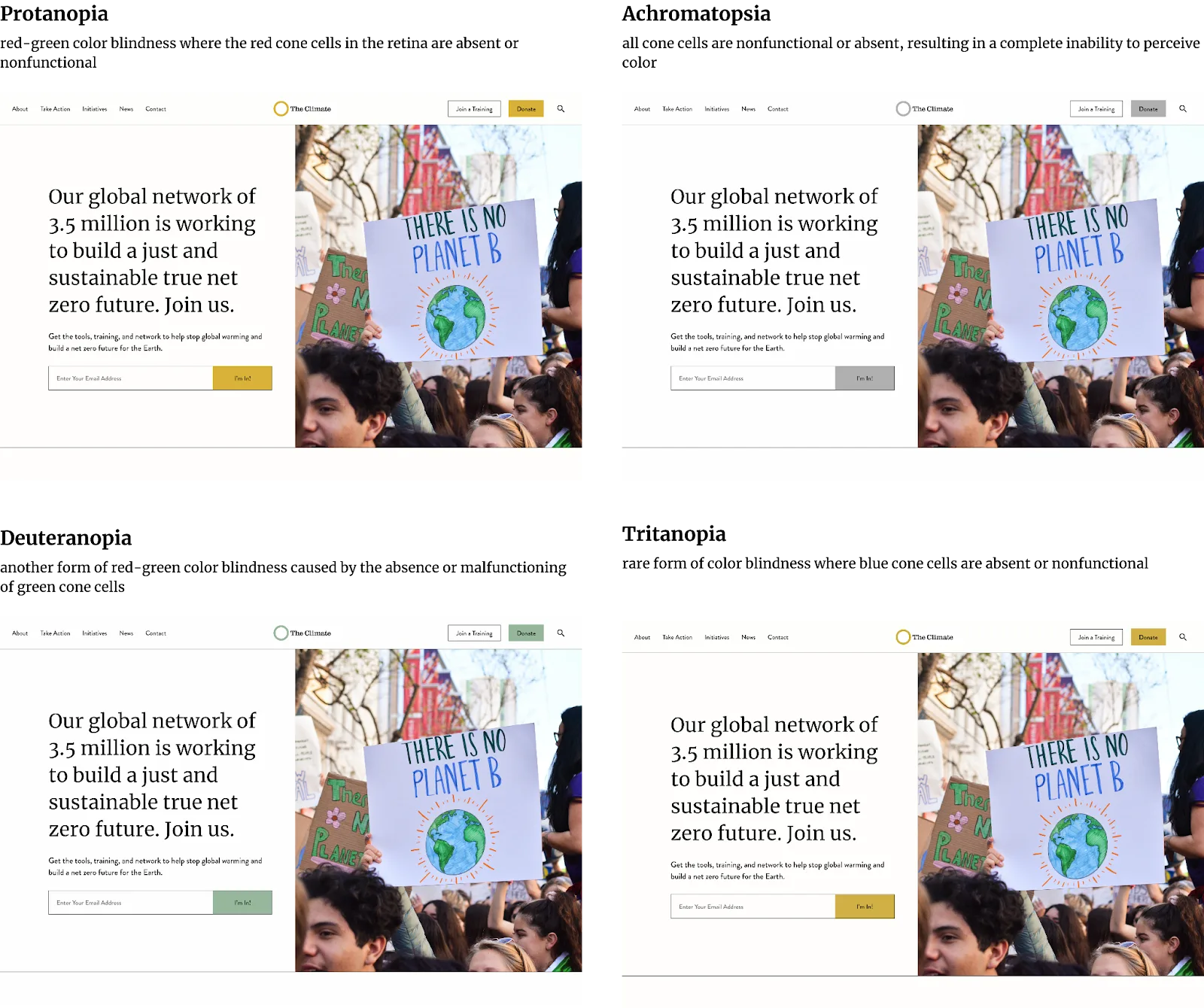
When you think your colors contrast enough, you can go to the next level and try the visual simulation to double-check your colors and how users with protanopia, deuteranopia, tritanopia, and achromatopsia would see your color palette.
Let’s take the hero section below. We have different shades of green and black fonts as we want to guarantee color contrast. But how do those colors behave if we take one of three basic colors from Red/Green/Blue?
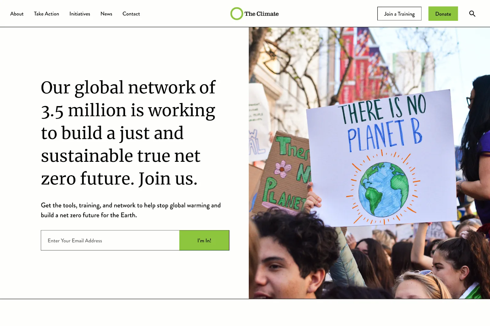
Below, you can see how our example changes when different areas of color are changed. All these aspects are essential to remember when working with colors, shades, and text.
Typography and Headings
Typography—how typefaces and fonts present text—plays a crucial role in readability, a key element of visual accessibility. Choosing the right fonts and typefaces ensures that your content is clear and easy to understand for all users. Here are some essential tips to enhance typography for accessibility:
Choose the Right Typeface
- Align with Your Brand - Select typefaces that match your content's tone, messaging, and brand identity.
- Prioritize Legibility - Typefaces with open counters (e.g., in letters like “c,” “o,” and “e”) make it easier for readers to distinguish similar shapes.
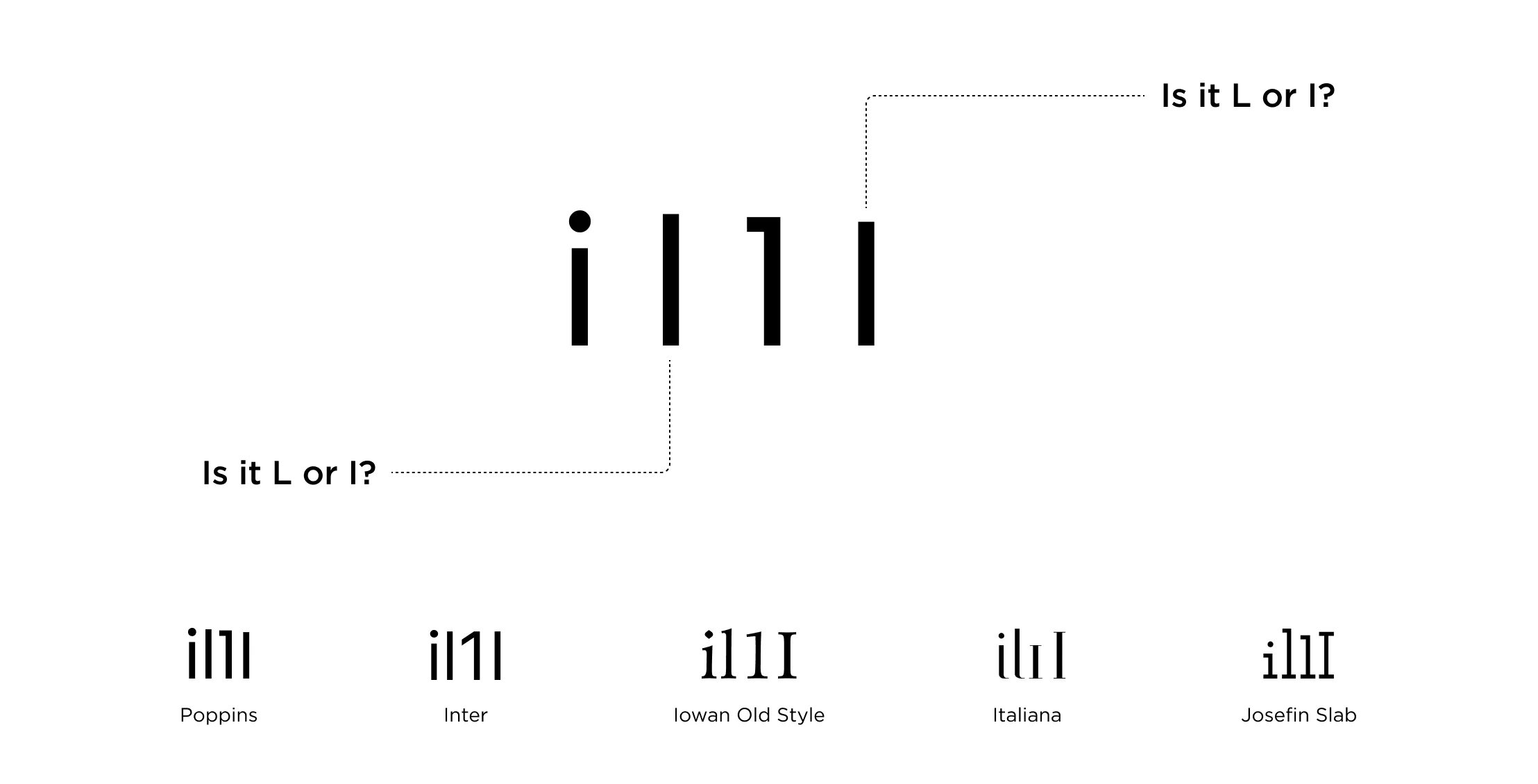
- Check Character Pairs - Ensure that characters like “qp,” “db,” “0O,” “il1I,” and others are visually distinct to prevent mirroring or transposition errors.
Improve Readability
- People with moderate to severe vision impairments may confuse characters like “o,” “c,” “e,” and “a.” Opt for typefaces where these letters are easily distinguishable to improve word recognition.
- Avoid condensed or thin typefaces, which can compromise readability, especially at smaller sizes.
Optimize Font Sizes
- Go Larger for Glanceable Content - Use larger font sizes for text that needs to be quickly read, such as headings, notifications, or instructions.
- Minimum Sizes - Use a minimum of 16px (1rem) for body text and avoid going smaller than 11px, as smaller fonts can strain readability.
Avoid All-Lowercase Text
- For glanceable or critical content, avoid using all-lowercase text, which can be harder to read at a glance.
Notifications and Feedback
- For elements like toasts, alerts, or system feedback, use non-condensed, larger fonts to promote quick readability and ensure users can easily process the information.
Web headings
In web typography, the structure of your content goes beyond visual design—it starts with proper HTML markup. This involves using the most appropriate elements, such as correctly leveled headings (h1, h2, h3, etc.), to create a clear and logical content hierarchy that aligns with your design.
Why Semantic HTML Matters
Using semantically structured HTML isn’t just a best practice—it’s essential for accessibility. Assistive technologies, like screen readers, depend on semantic markup to interpret and convey the structure of your content to users who can’t see it visually.
Screen readers use this semantic information to communicate critical details, such as:
- The order and importance of headings.
- The relationships between sections of content.
- Navigation points, ensuring users can efficiently move through the page.
Reflecting Visual Hierarchy Through Markup
The HTML structure should mirror your page’s visual hierarchy, helping users interpret content as intended. Screen readers process content in a logical sequence, typically following the document flow from the top left (Step 1) to the top right (Step 2), bottom left (Step 3) to bottom right (Step 4) of the page, ensuring an organized and meaningful reading experience.

By prioritizing semantically structured HTML, you enhance both the accessibility and usability of your web typography, ensuring your content is inclusive and functional for all users.
Touch Target
You might be wondering, what exactly is a touch target? Simply put, touch targets are the parts of a screen that respond to user input, often extending beyond the visible boundaries of an element. For example, a button might visually appear to be 48 x 36 px, but with padding, the full touch target could be 48 x 48 px.

Why Accessible Touch Targets Matter
Accessible touch targets are essential for creating an inclusive user experience, benefiting a wide range of people, including:
- A larger touch target makes it easier to interact with content on compact screens.
- Those with dexterity disabilities rely on touch targets that are forgiving and easy to press.
- Whether carrying something or using only part of their fingers, one-handed users need accessible design.
- Smaller targets can be difficult for those with larger hands to tap accurately.
- Larger touch targets improve visibility and make it easier to locate and interact with elements.
- People using public transportation or moving in unstable environments benefit from easier-to-tap elements.
Designing touch targets that are appropriately sized and responsive ensures your digital experience is accessible, intuitive, and user-friendly for everyone.
Alternative text (alt-text)
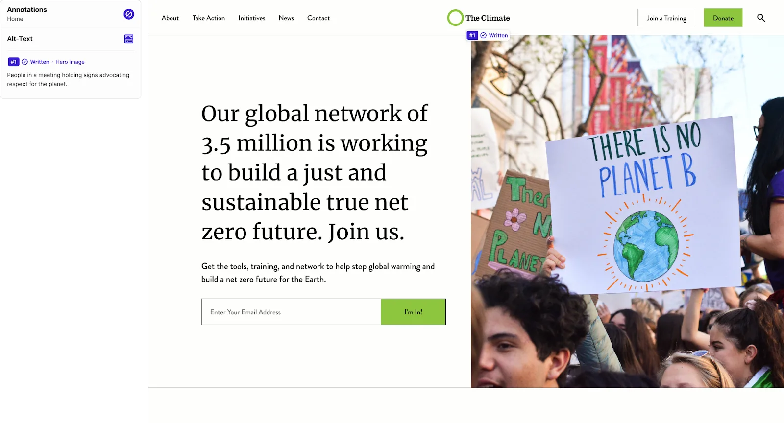
Alternative text, or alt text, is off-screen text that provides descriptions of visual elements for screen reader users. Screen readers use alt text to convey information about non-text content, such as images, icons, and headings, ensuring accessibility for users who cannot see the content.
Alt text also serves another purpose: when an image fails to load, the alt text appears in its place, helping users understand what the image represents.
When to use alt text
Deciding when to use alt text depends on the purpose of the image:
- Decorative Images - If removing the image doesn’t affect the meaning or context of the page, the image is decorative and doesn’t need alt text. Leaving the alt attribute empty (e.g., alt="") tells screen readers to skip it.
- Informative Images - If the image conveys important information or context, always include descriptive alt text. This ensures all users, including those relying on screen readers, can fully understand the content.
Key Takeaways
- Alt text makes content more accessible for people with visual impairments.
- It improves usability by providing context when images don’t load.
- Use alt text thoughtfully—focus on describing meaningful images while skipping purely decorative ones.
Tools for Testing Accessibility
Accessibility doesn’t have to feel overwhelming. A wide range of tools is available to help you identify issues and make your site more inclusive. Here are some of the most effective ones:
- WAVE Accessibility Checker: Ideal for quick assessments, it highlights common accessibility issues directly on your page.
- Axe (Browser Extension): Provides detailed insights into WCAG violations, helping you pinpoint areas that need improvement.
- Lighthouse (Chrome DevTools): A powerful, all-in-one tool for conducting performance, accessibility, and SEO audits.
- Color Contrast Checkers: Ensure your text is readable by using tools like WebAIM’s Contrast Checker or Stark, a Figma/Sketch plugin designed for design tools.
The Business Benefits of Accessibility
Accessibility isn’t just the right thing to do—it’s a smart business decision. Here’s why making your website accessible pays off:
1. Improved SEO
- Search engines favor accessible websites. Features like alt text, semantic headings, and clean navigation enhance both user experience and search engine rankings, driving more traffic to your site.
2. Broader Audience Reach
- An accessible website appeals to a wider audience, including the estimated 15% of the global population with disabilities. By removing barriers, you make your content available to more people, increasing engagement and conversions.
3. Legal Compliance
- Accessibility is mandated by laws such as the Americans with Disabilities Act (ADA). Complying with these regulations not only avoids potential legal issues but also demonstrates your commitment to inclusivity and social responsibility.
4. Enhanced Usability for Everyone
- Accessibility features like captions, alt text, and responsive design improve the experience for all users—not just those with disabilities. A well-designed accessible site is easier to navigate, read, and engage with for everyone, regardless of ability or device.
Final Thoughts
Accessibility is more than a checklist—it’s a commitment to creating inclusive digital experiences that benefit everyone. By prioritizing accessibility, you’re not only meeting the needs of people with disabilities but also enhancing usability, improving SEO, and expanding your audience reach.
Remember, accessibility isn’t just the right thing to do—it’s a smart business move. It aligns with legal requirements, strengthens your brand’s reputation, and future-proofs your digital presence. By investing in accessibility, you’re building a better web for all.
